Ogunyinka Oluwatobi

Oluwatobi Ogunyinka

Designing systems that help businesses operate better.

I specialize in enterprise SaaS, marketing technology, insurance technology, fintech, and AI-powered products, creating experiences that simplify complexity, improve workflows and drive meaningful business outcomes. Currently designing payment infrastructure at SeerBit.

A few things I have designed

Selected work exploring how design structure and interaction craft can bring order to complex workflows.
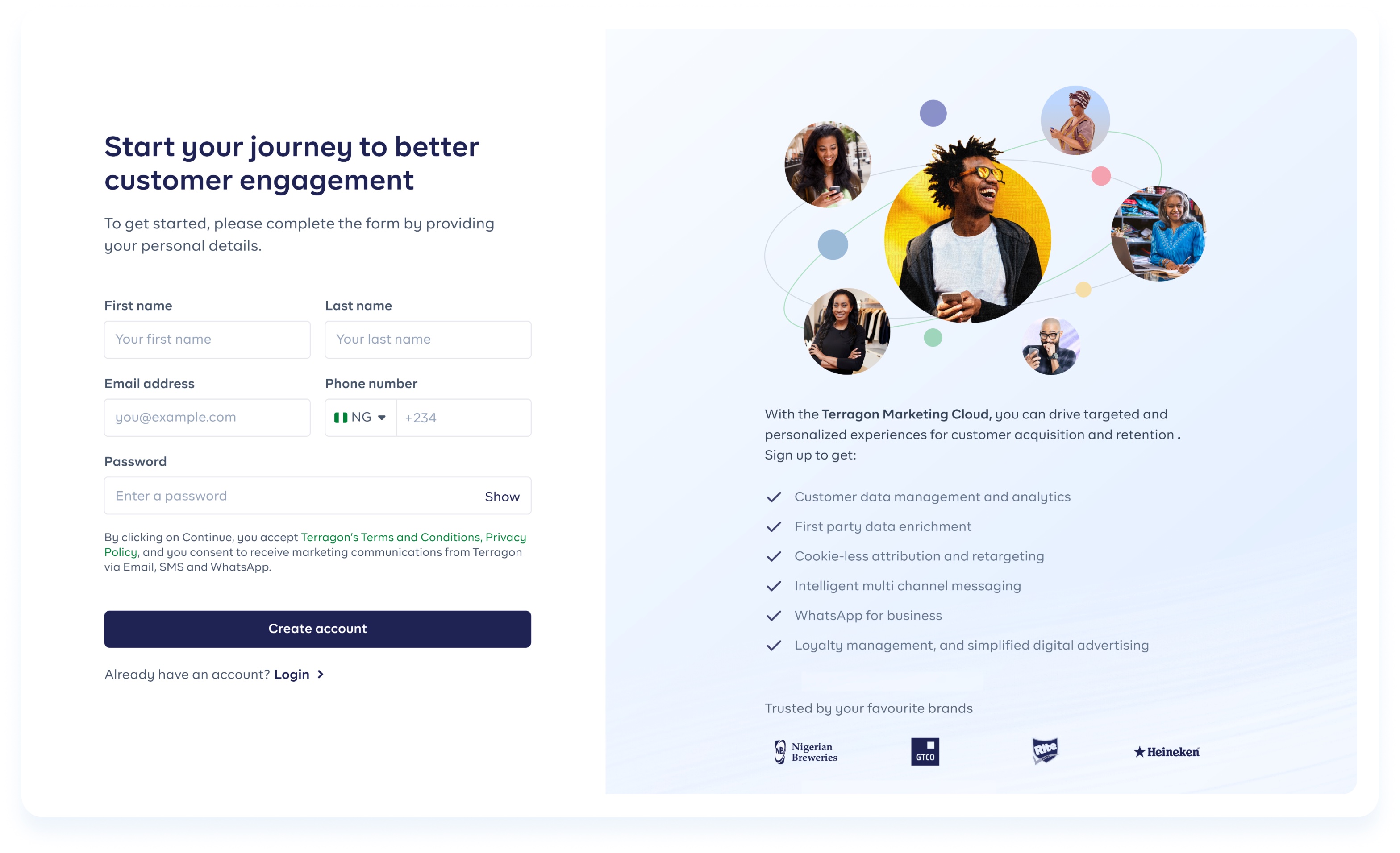
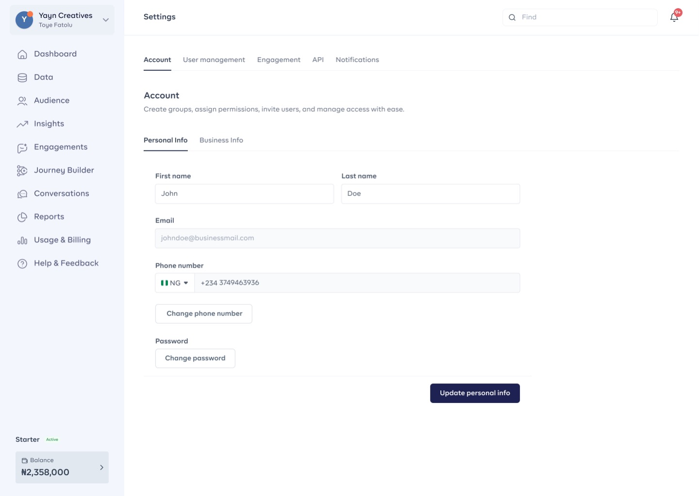
Marketing Cloud
MARKETING CLOUD 2024

Designing a multinational cloud-based marketing solution
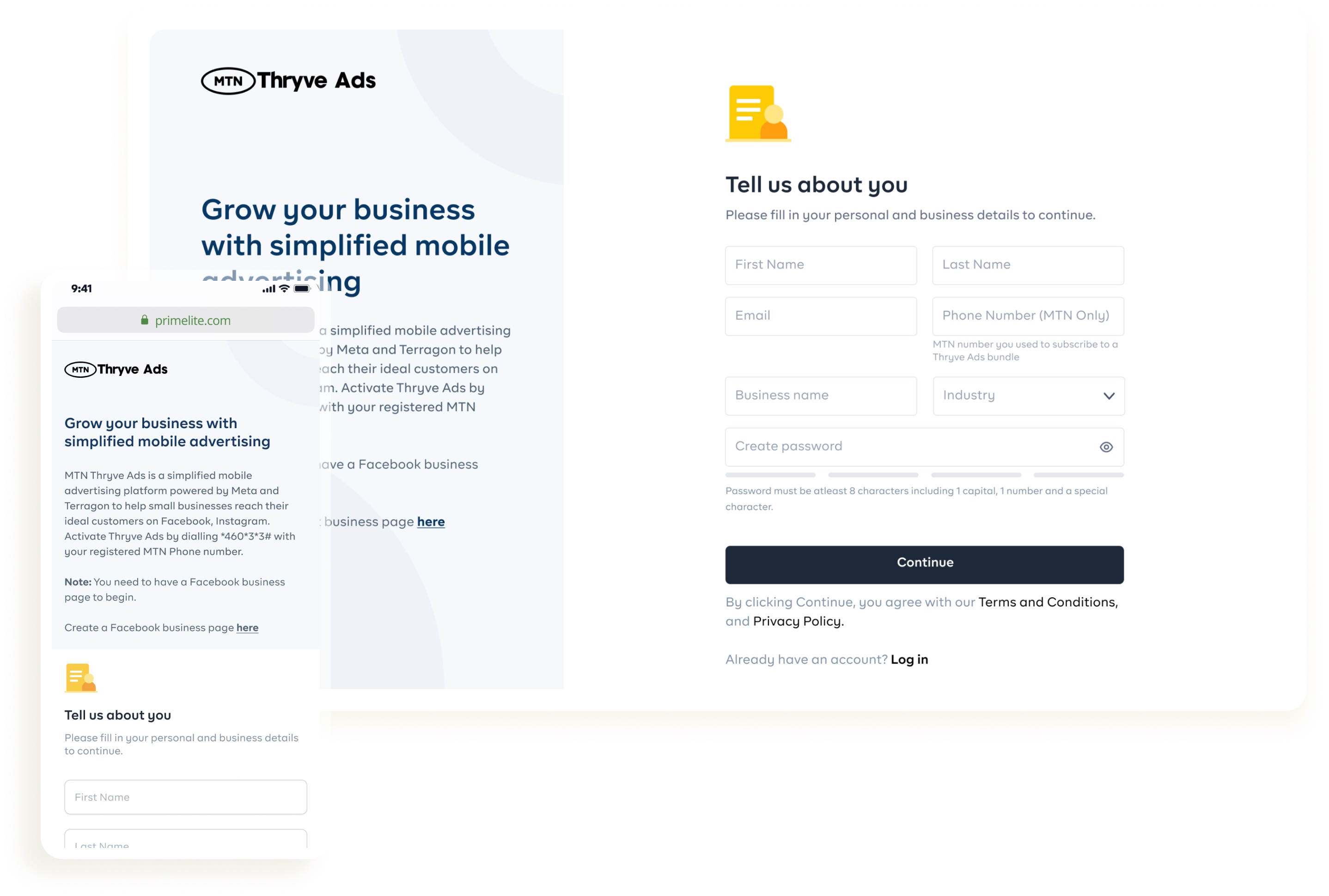
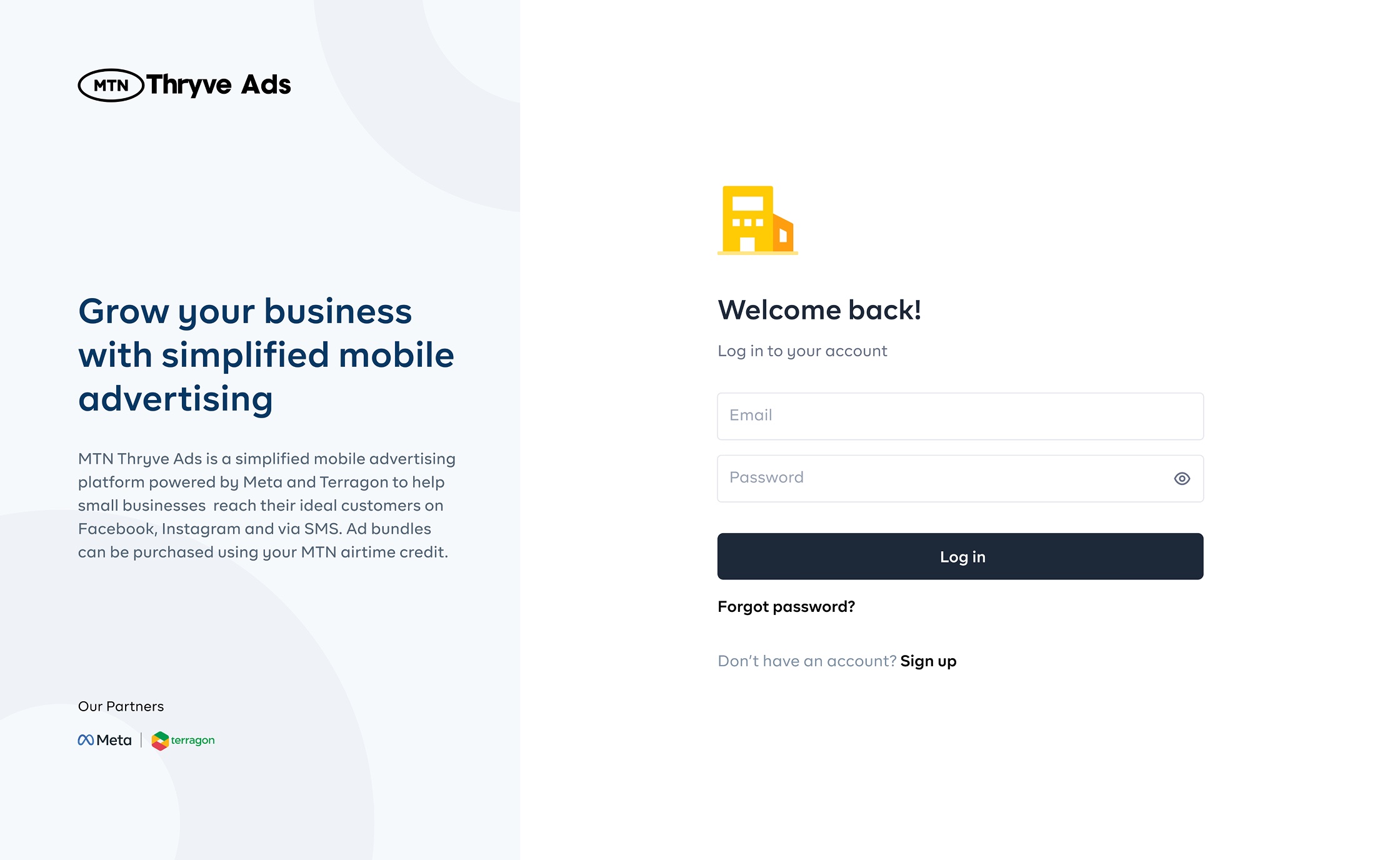
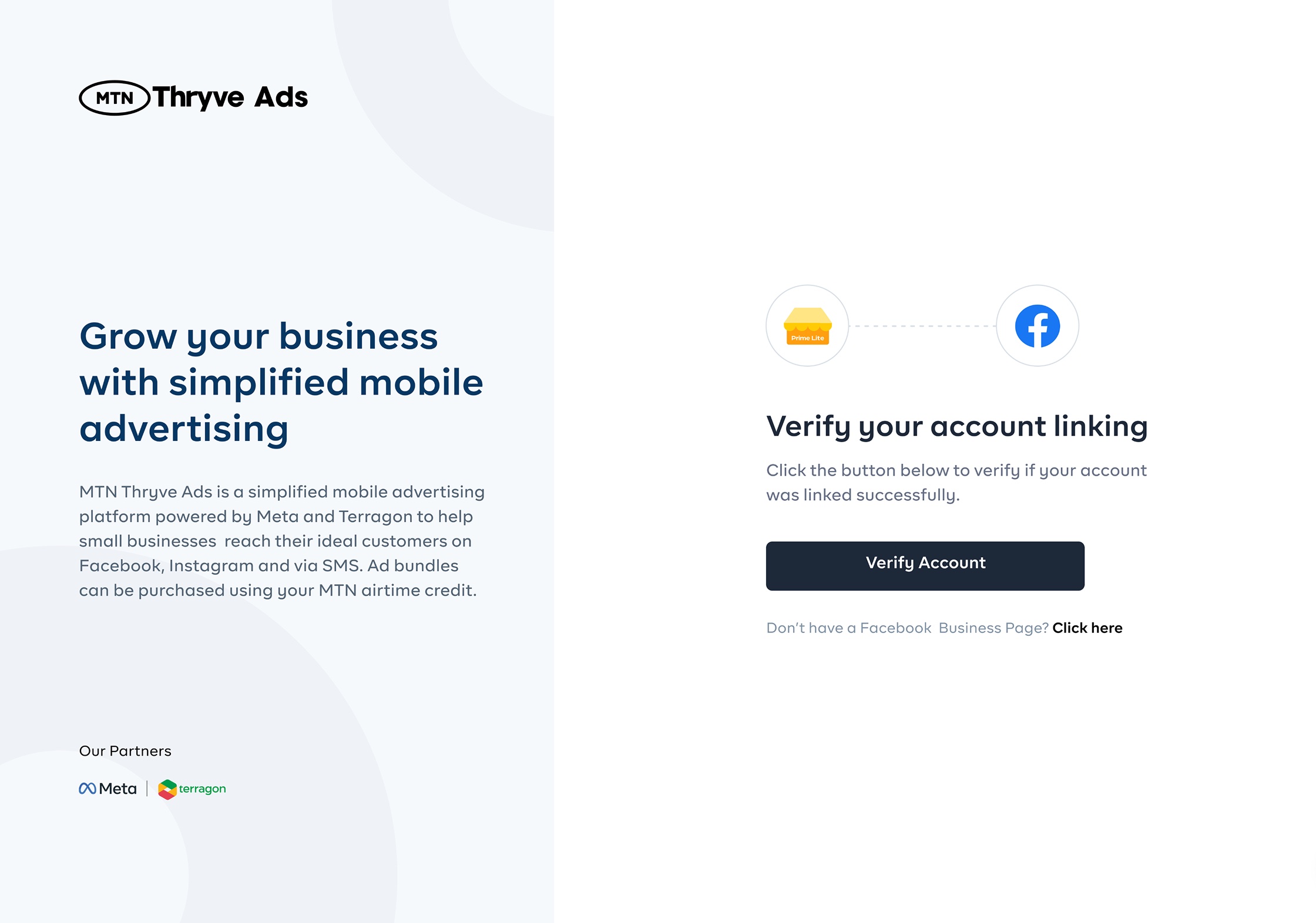
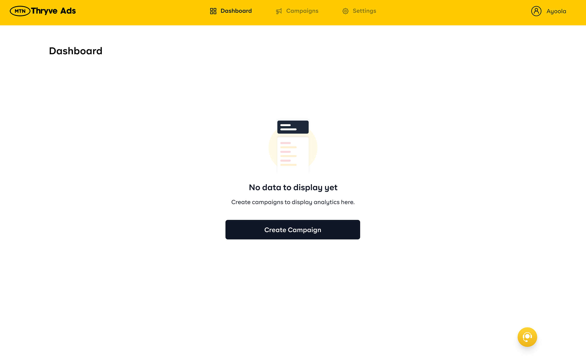
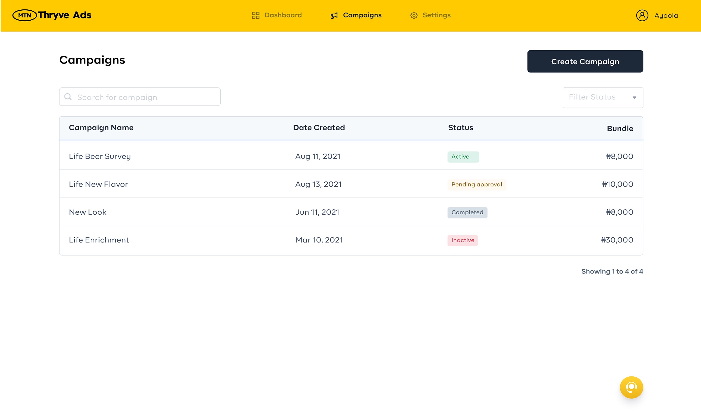
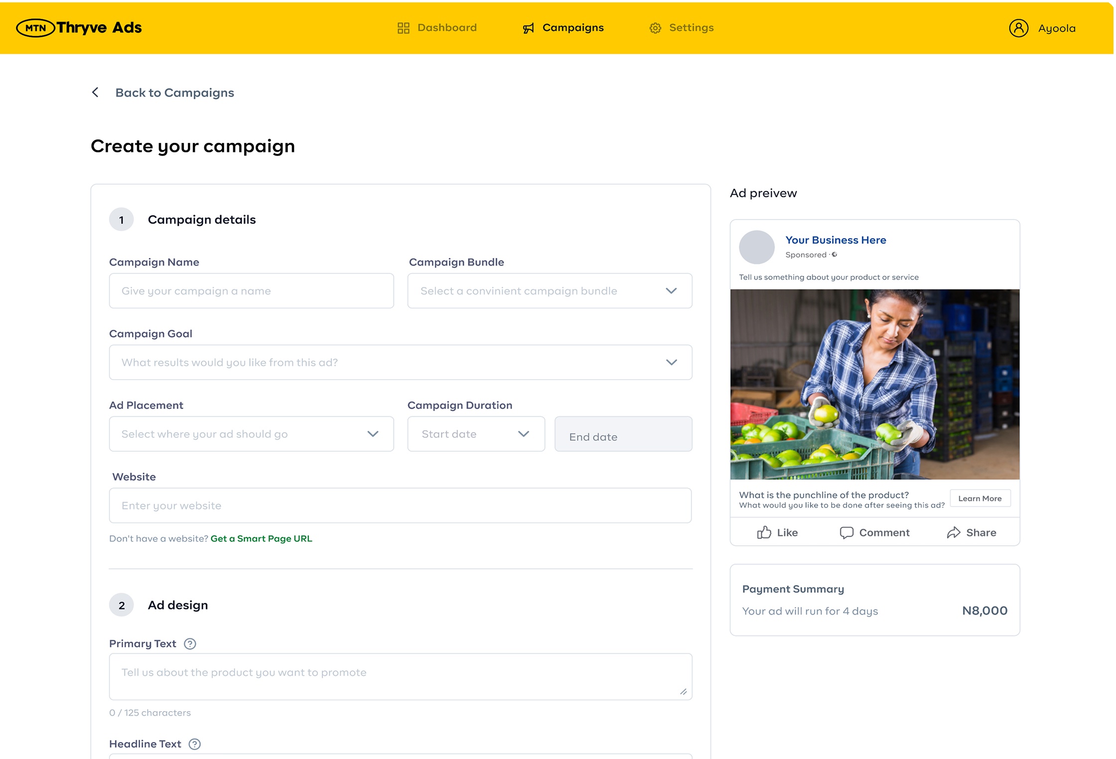
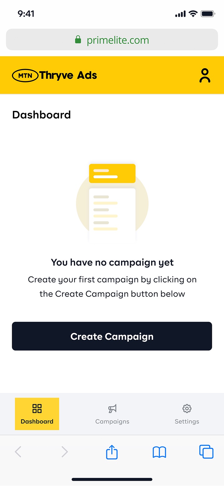
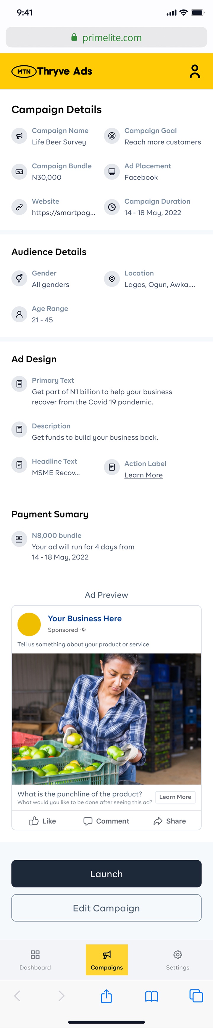
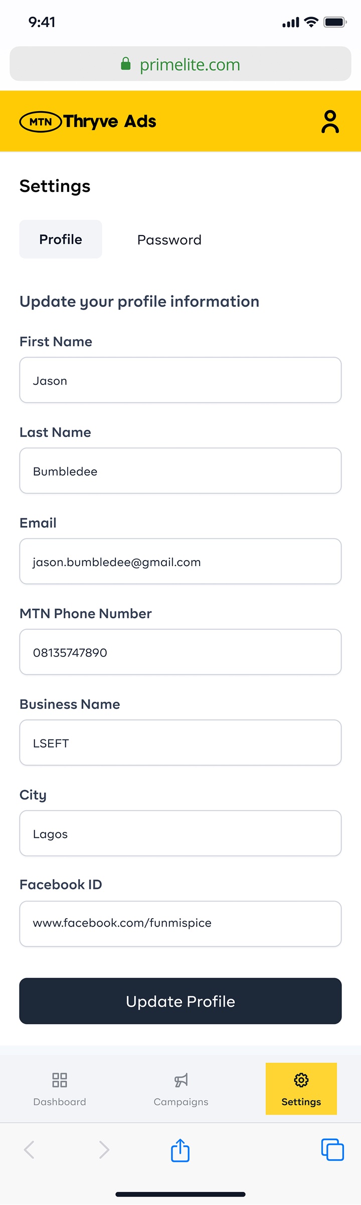
MTN Thryve Ads
MTN THRYVE ADS 2024

Designing a simplified mobile advertising platform
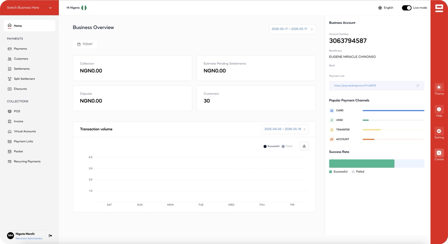
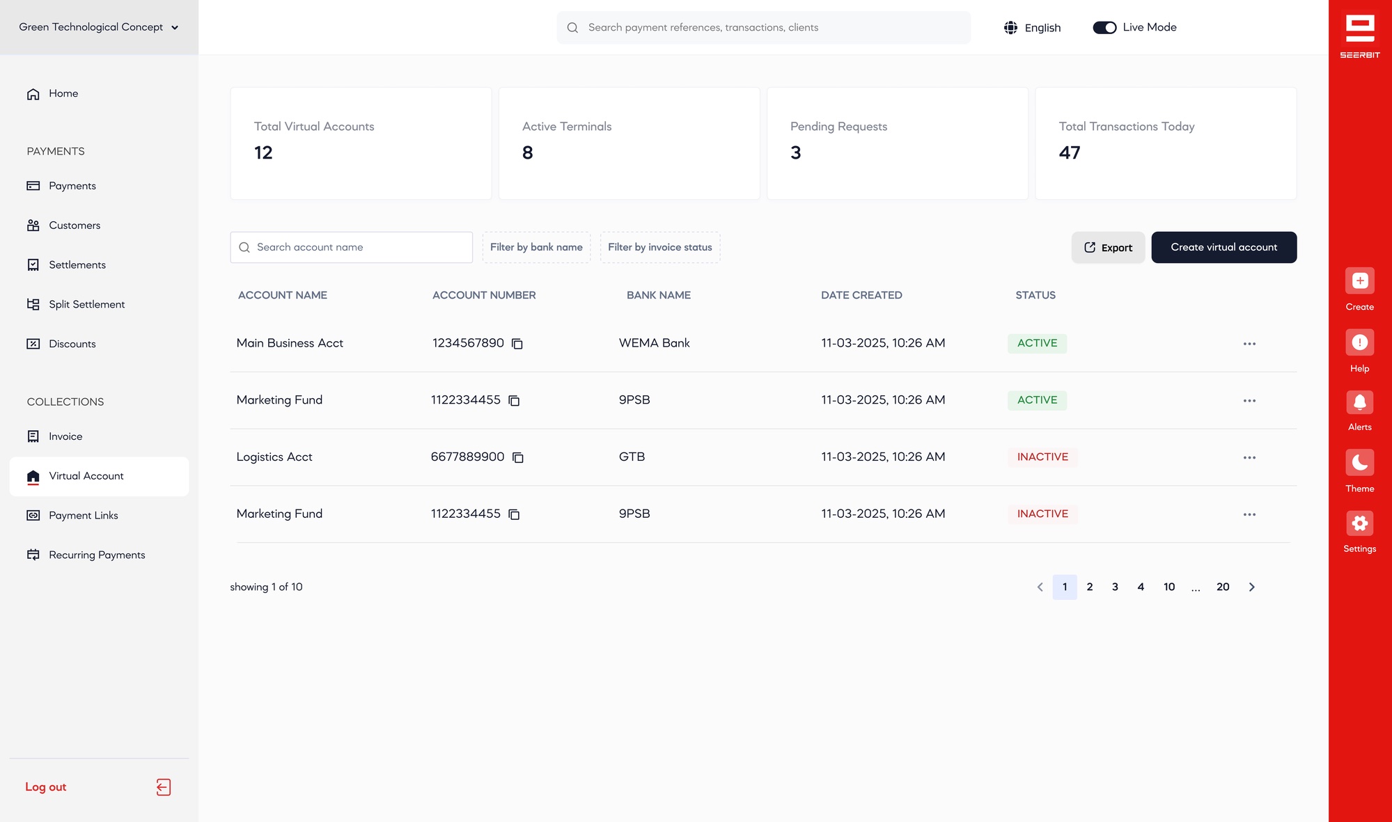
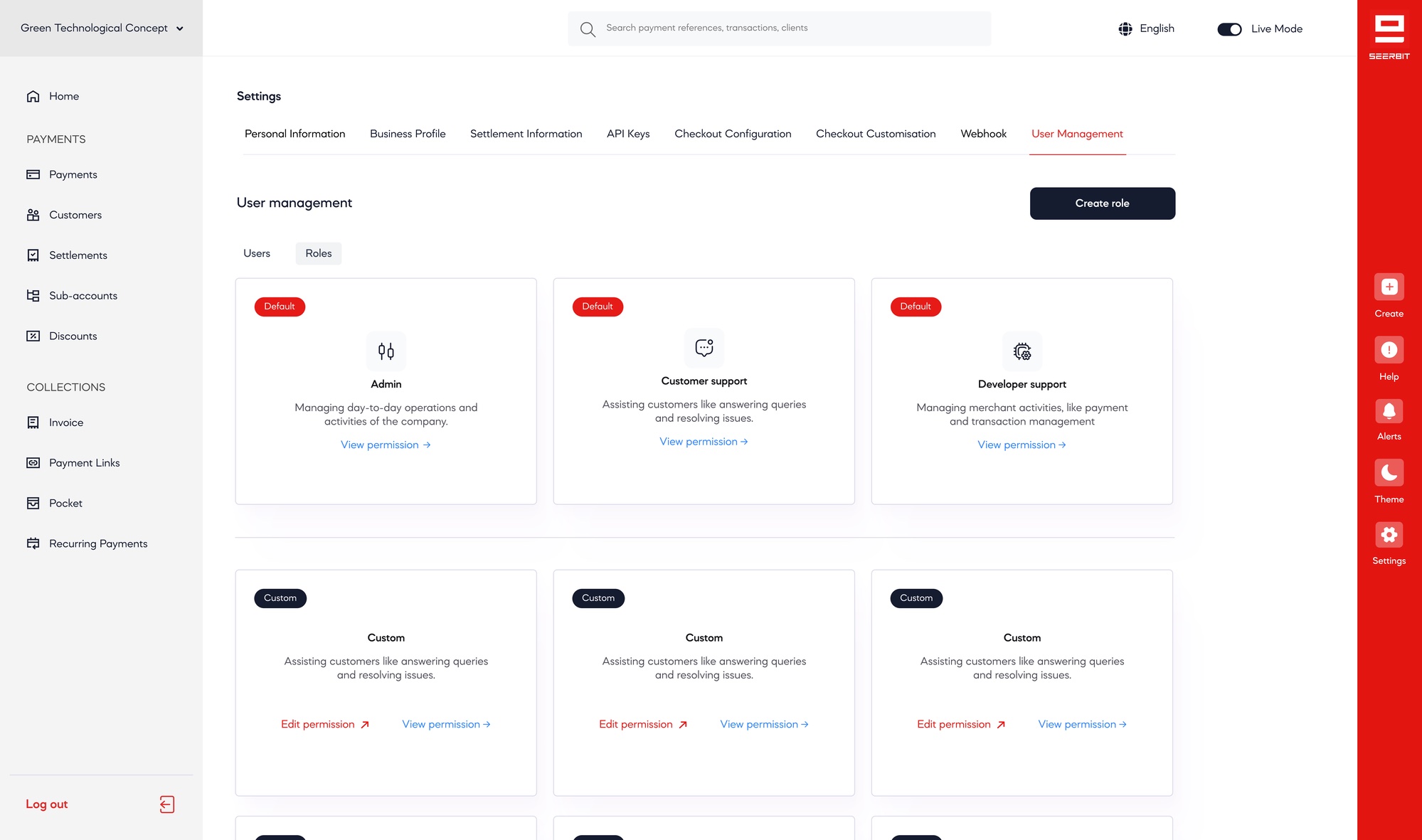
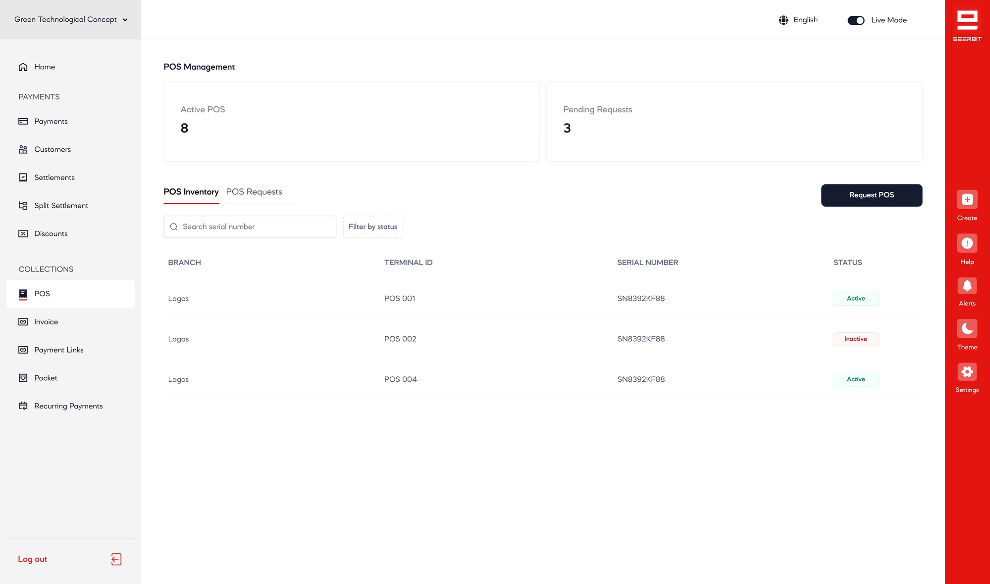
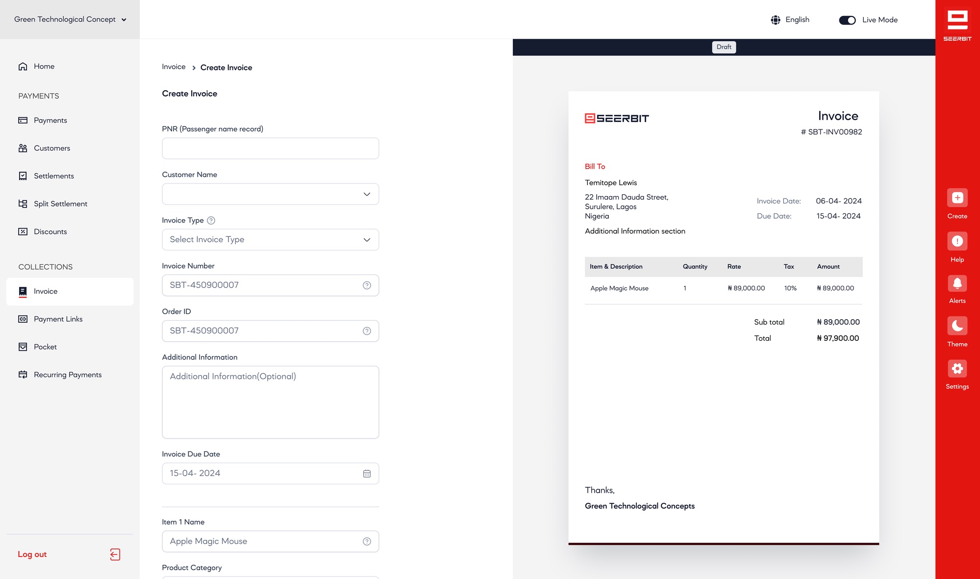
Seerbit Merchant Dashboard
SEERBIT MERCHANT DASHBOARD 2024

Designing the merchant operating system for payments, settlements, and business growth
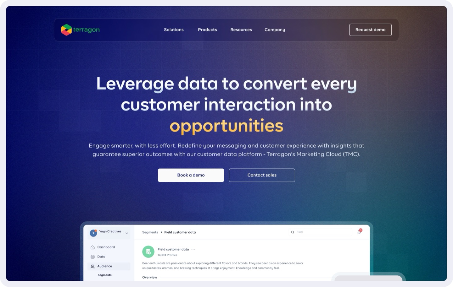
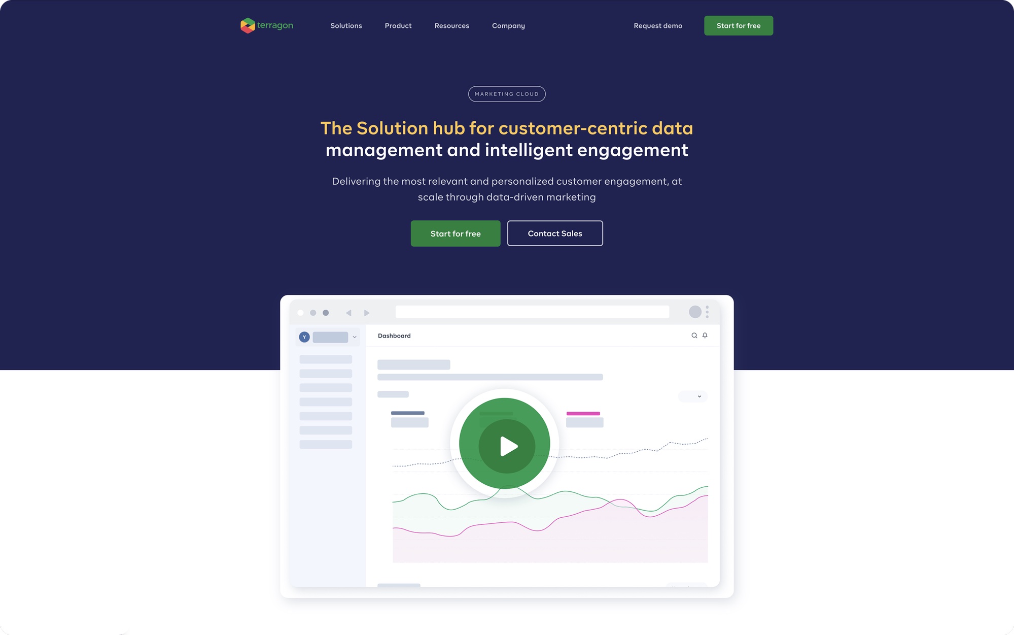
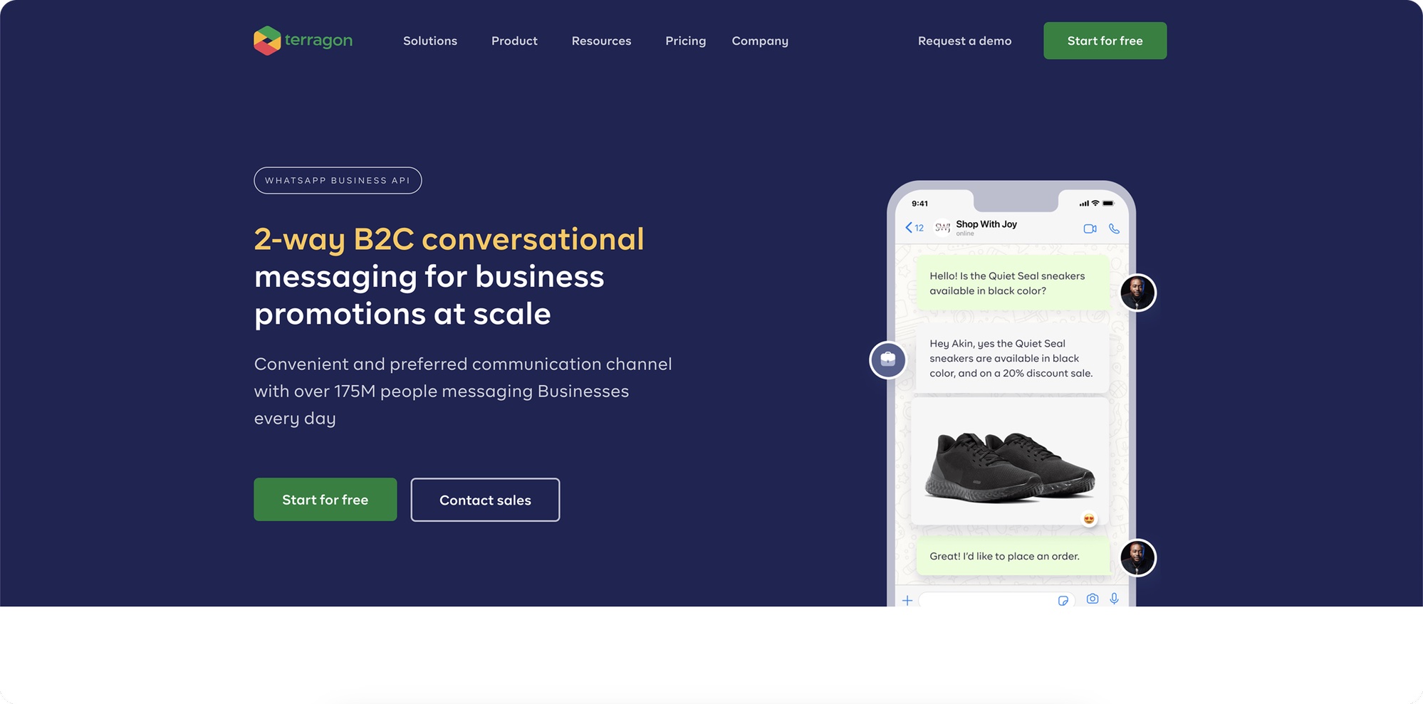
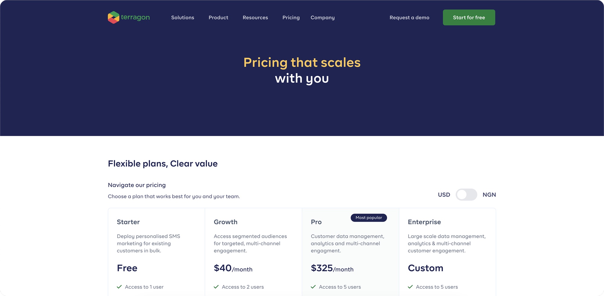
Terragon Marketing Cloud Website
TERRAGON 2023

Building a marketing technology website for Africa's largest Cloud Data Platform.
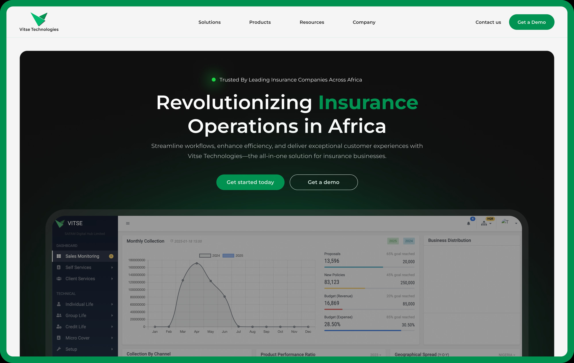
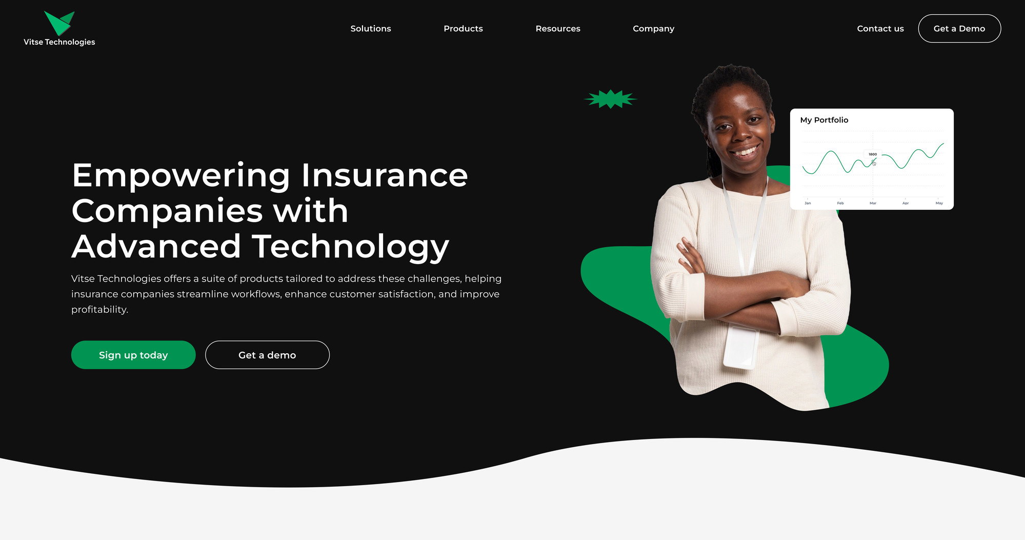
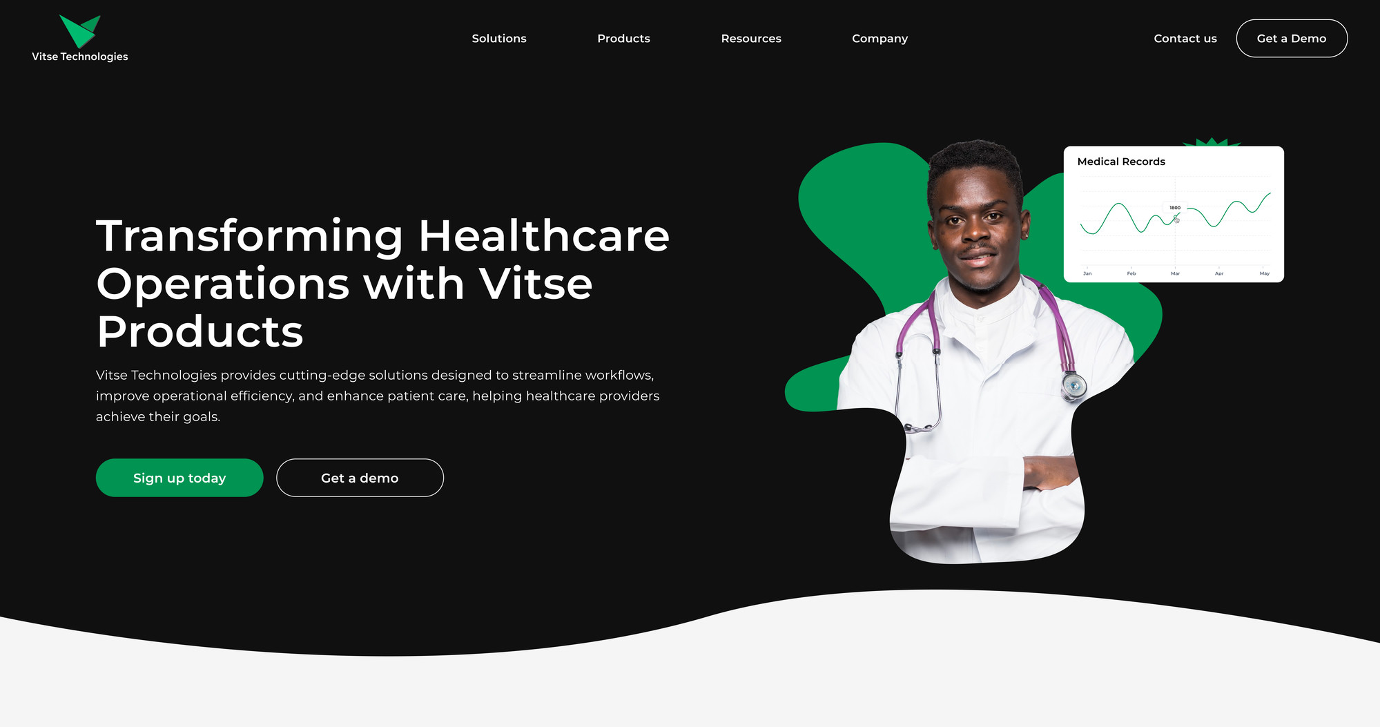
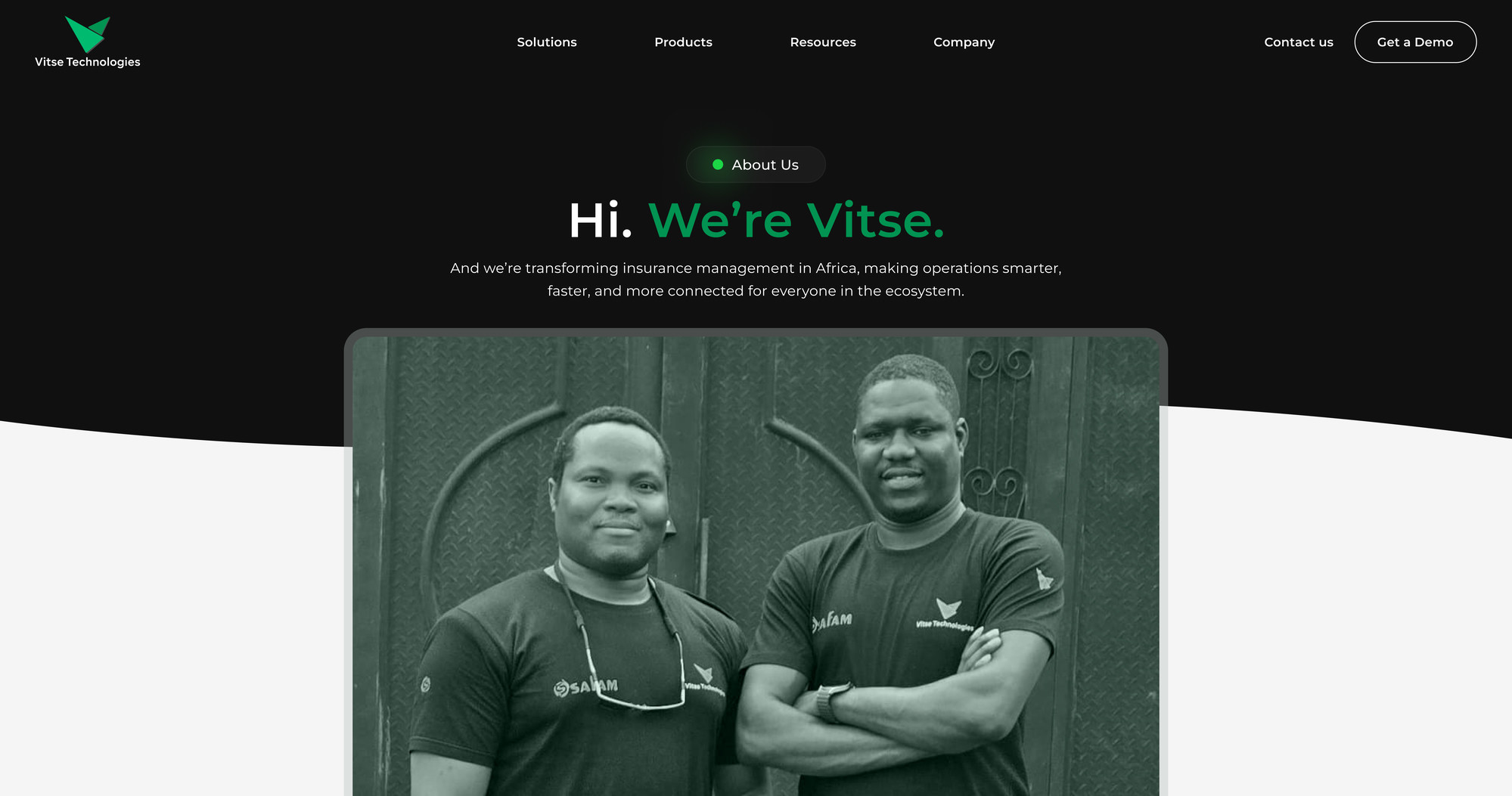
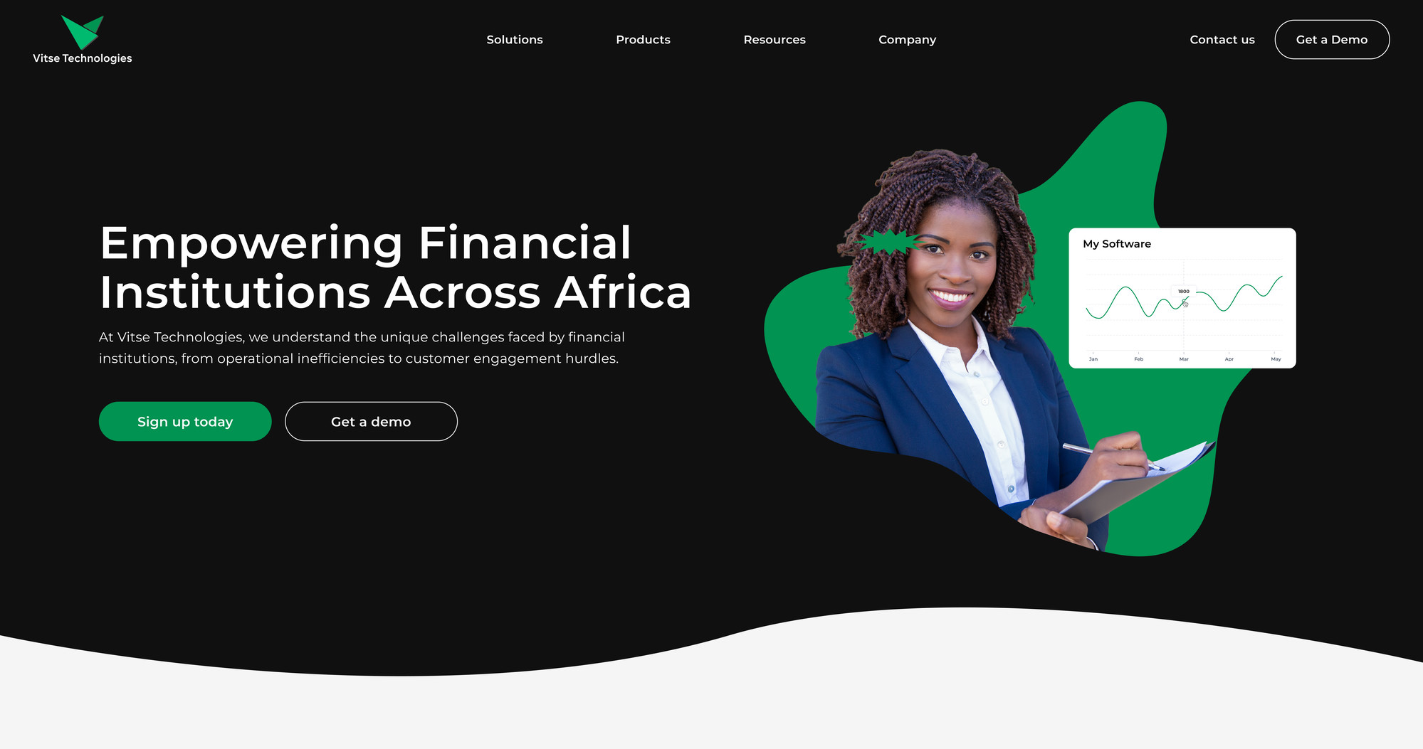
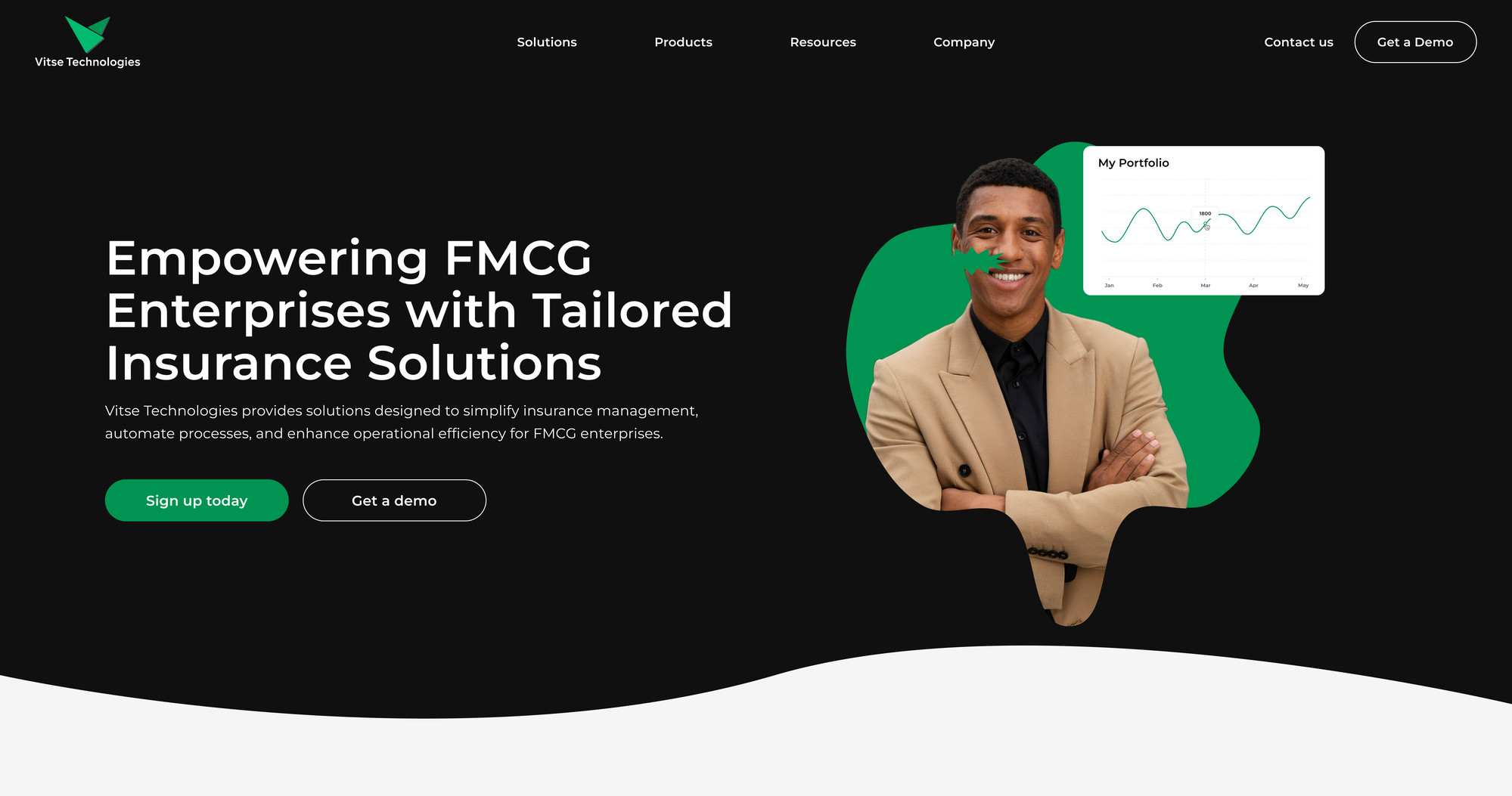
Vitse Technologies
VITSE 2025

Designing digital infrastructure for modern insurance operations

I design practical, inclusive, and visually striking digital experiences.

With over four years of experience spanning UI/UX, visual design, and user research, my philosophy is simple: build for people, optimize for impact. I am currently a Senior Product Designer at Seerbit, where I focus on designing seamless, inclusive financial solutions that drive revenue growth and elevate user engagement.

My approach is deeply rooted in my early foundation as a creative designer. Having spent the beginning of my career crafting compelling brand identities, I developed a sharp eye for aesthetic precision. This background allows me to seamlessly weave striking visual elements into functional product architectures.

When I step away from the screen, I find balance and inspiration through recording songs, getting lost in films, and practicing mindfulness.

Ogunyinka Oluwatobi

Latest Experiences

2025 — Present

Senior Product Designer

Seerbit

Leading the end-to-end UX redesign of Pocket Fund Management and Payout dashboards, driving a 30% increase in completions. Mentoring designers and leveraging behavior analytics to inform iterations.

2022 — 2025
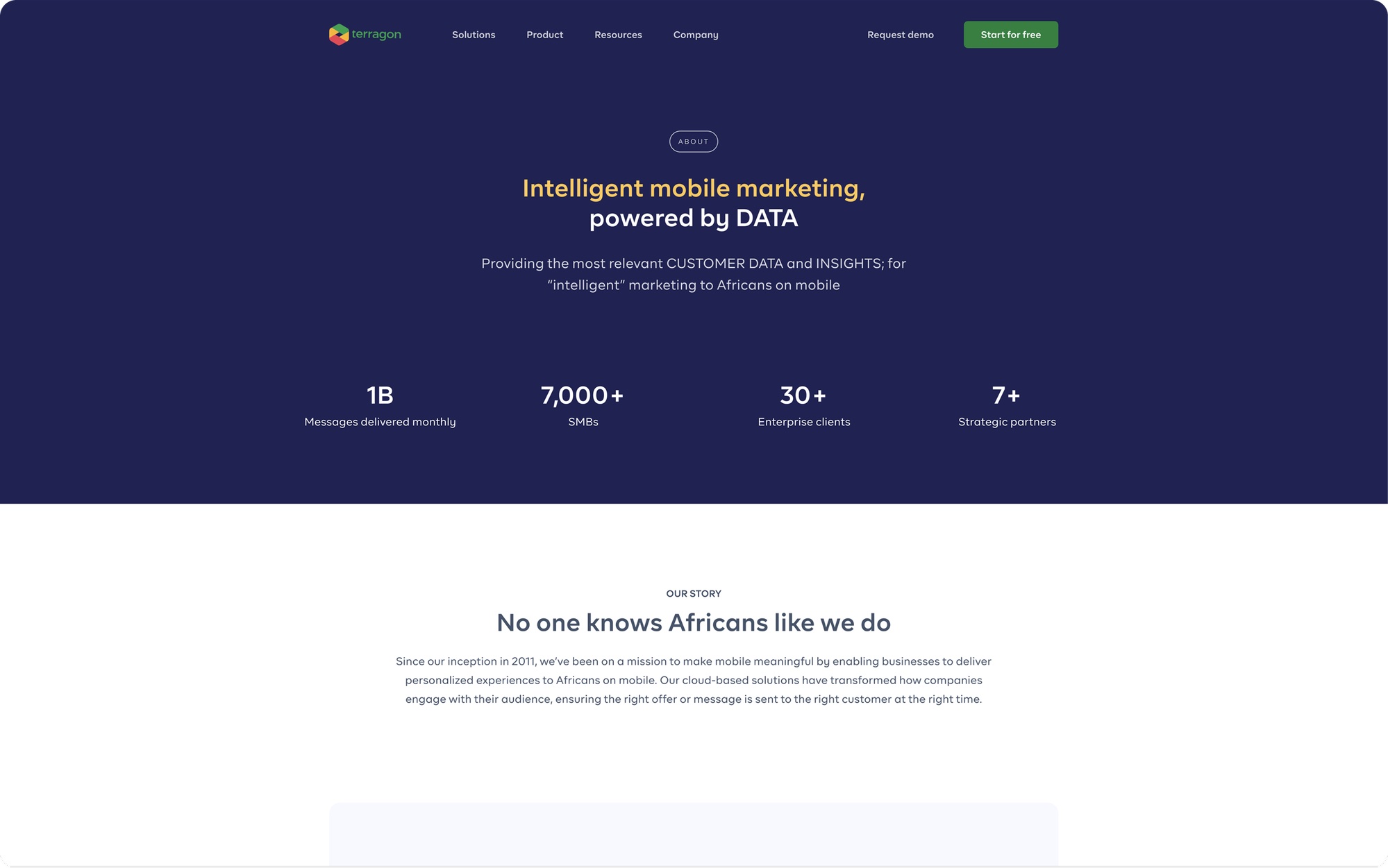
Product Designer & No-Code Developer

Terragon Group

Owned the atomic design system to ensure global UI consistency. Designed high-fidelity interfaces for Marketing Cloud, driving engagement, and led rigorous behavioral-science user research.

2021 — 2022

Product Designer

Vitse Technologies

Conducted market-specific UX research for the African insurance sector to drive product strategy. Built Vitse's first scalable design system and optimized critical user onboarding flows.

Research Interests

Human–AI Interaction

Exploring how users trust, delegate to, and collaborate with intelligent systems. I focus on designing interfaces that make AI assistance transparent, predictable, and highly controllable for the end user.

Behavioural Design

Applying insights from psychology and behavioral science to product architecture. I believe in designing user flows that reduce cognitive load, guide positive habits, and gracefully handle user friction.

Interactive Systems

Crafting micro-interactions and feedback loops that make digital products feel alive and responsive. Pixel-perfect execution and thoughtful interaction design matter most when paired with strong logic.

Intelligent Interfaces

Designing systems that adapt to user expertise over time. The best design empowers users to accomplish complex tasks with confidence, making experts more efficient and novices feel capable.

Capabilities

Design

  • User Experience (UX)
  • Visual Design
  • Information Architecture
  • Design Systems
  • Micro-interactions
  • Prototyping
  • Accessibility

Research

  • Design Research
  • Usability Testing
  • Behavioural Analysis
  • Heuristic Evaluation
  • Heatmap Analytics

Technical

  • HTML/CSS
  • Javascript
  • Figma Variables
  • Webflow
  • Elementor
  • Python (Learning)

Tools

  • Figma
  • Hotjar
  • Lookback
  • Google Analytics
  • Notion
  • Slack

Trusted by top companies

UI/UX Case Study

Designing a unified customer engagement platform for enterprise marketing teams

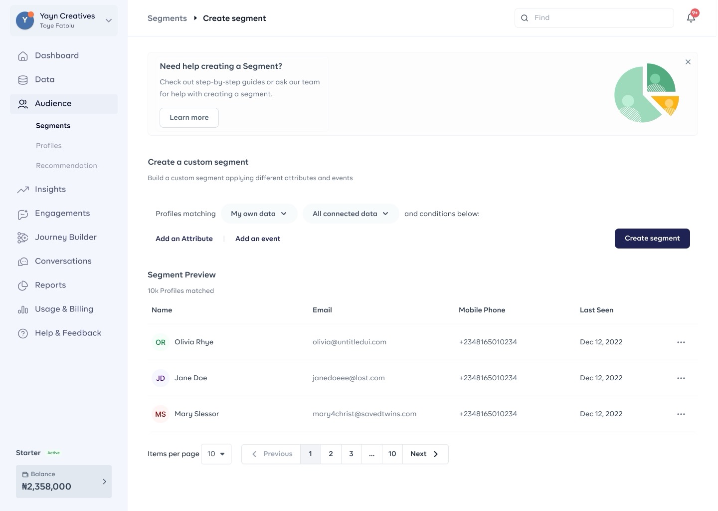
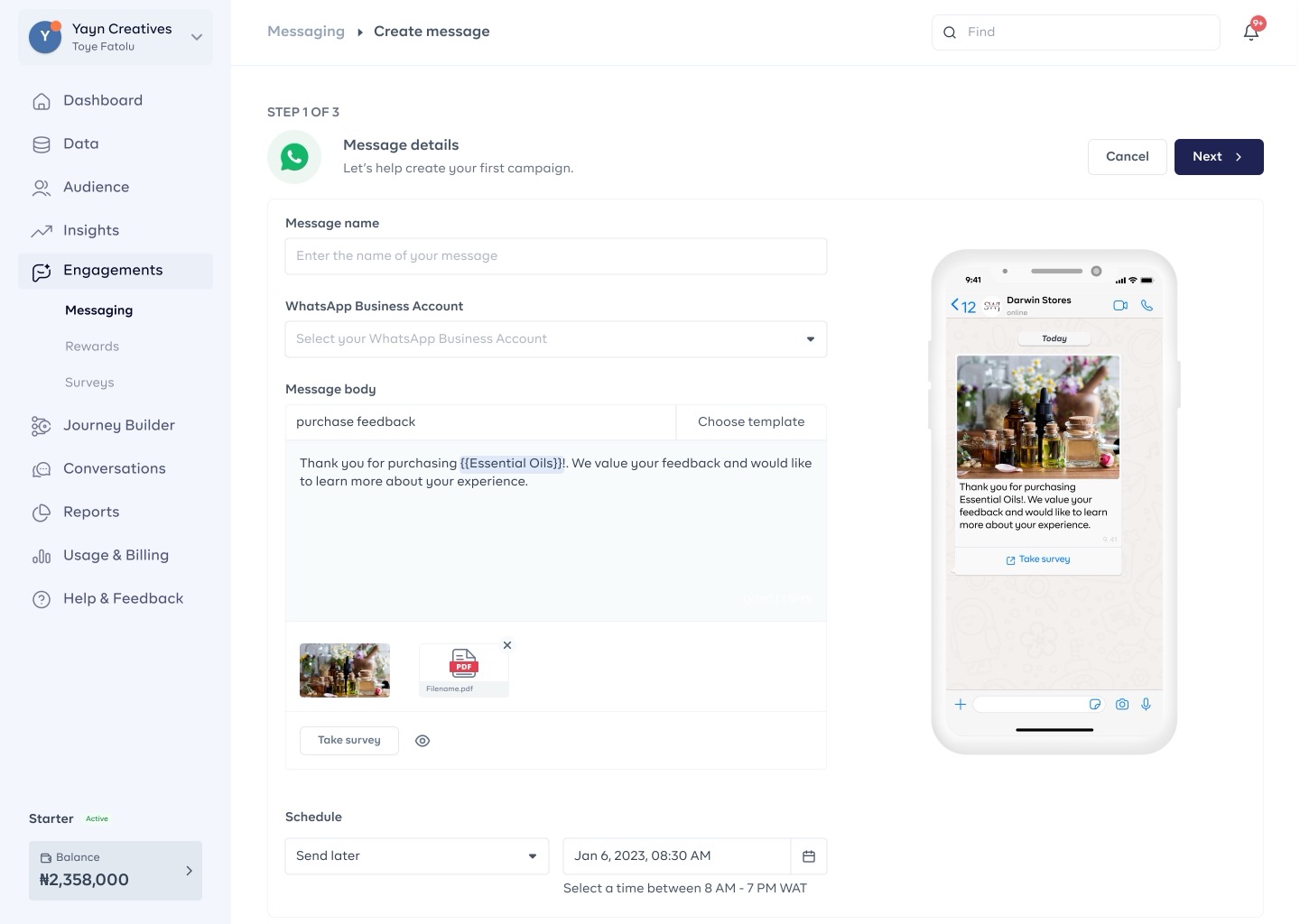
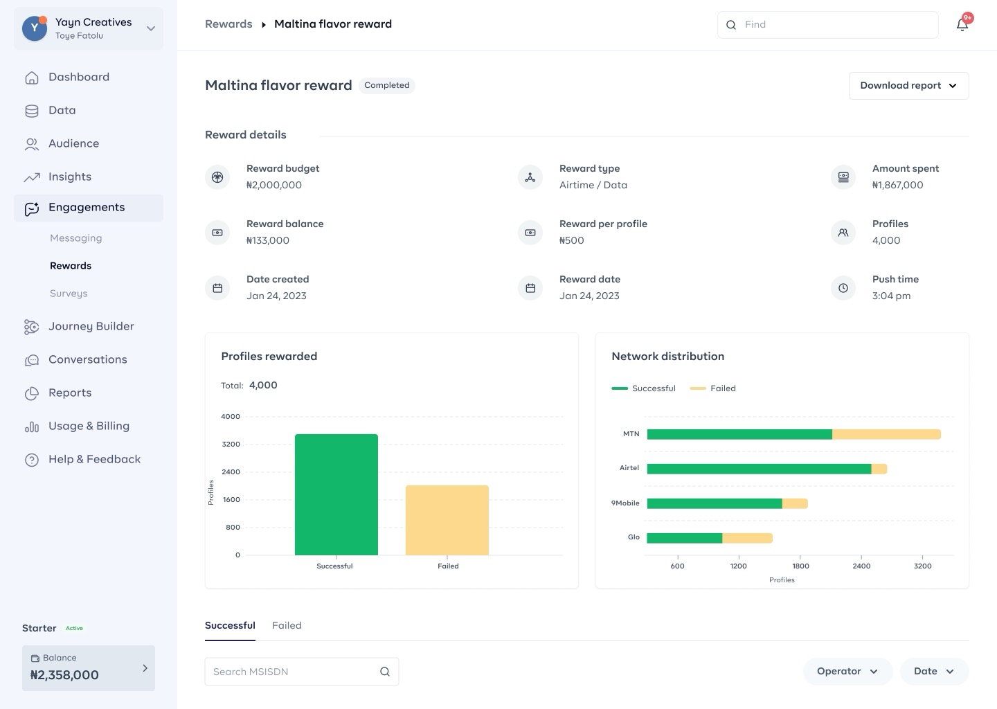
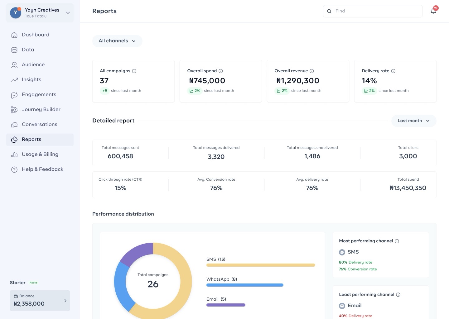
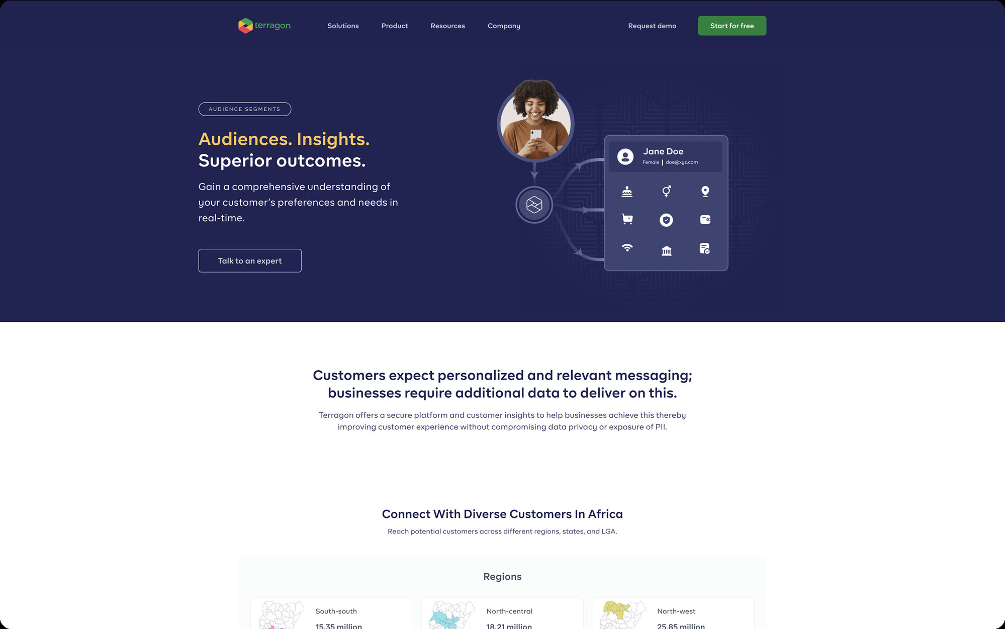
Marketing Cloud was designed to help enterprises centralize customer data, orchestrate multi-channel campaigns, and deliver personalized engagement experiences across SMS, Email, WhatsApp, Rewards, and Surveys.

Enterprise SaaS 2022–2025 Terragon Group
Role
Product Designer
Company
Terragon Group
Timeline
2022 – 2025
Industry
Marketing Technology
Platform
Enterprise SaaS
Responsibilities
UX Strategy Product Design Design Systems Interaction Design Prototyping
01 — The Problem

Fragmented tools.
Disconnected data.
Missed engagement.

Enterprise marketing teams were managing customer engagement across fragmented tools and disconnected datasets, making it impossible to create consistent, personalized experiences across channels.

Coordinating a single multi-channel campaign required input from 3–5 separate tools, with no unified view of customer state or engagement history. Teams were spending more time managing tools than managing campaigns, and the cost showed in missed windows and inconsistent messaging.
Fragmented customer data siloed across unconnected platforms
No unified orchestration layer for multi-channel campaigns
Campaign setup averaged 3–5 days due to workflow fragmentation
Near-zero real-time visibility into cross-channel engagement performance
Steep learning curve locking out non-technical marketing teams entirely
02 — Business Goals

Five principles to guide every design decision

Simplify campaign operations
Reduce the steps to launch multi-channel campaigns from days to minutes.
Improve engagement workflows
Create seamless end-to-end flows that support the full customer lifecycle.
Enable multi-channel personalization
Consistent, personalized experiences across SMS, Email, WhatsApp, and more.
Increase operational efficiency
Streamline team collaboration and reduce manual overhead in campaign ops.
Create scalable infrastructure
Build a platform foundation that grows with enterprise needs without added complexity.
03 — Research & Discovery

Understanding enterprise workflows before touching a frame

01
Competitor Audit
Benchmarked against Salesforce Marketing Cloud, HubSpot, and Klaviyo to understand enterprise SaaS conventions and identify strategic gaps.
02
Workflow Analysis
Mapped existing marketing team workflows to identify friction points, redundant steps, and high-value automation opportunities.
03
Usability Research
Conducted sessions with enterprise users observing data-heavy interactions and surfacing the critical pain points that shaped every design decision.
04 — Design Approach

Balancing power with simplicity

The direction focused on enterprise-level functionality without sacrificing clarity. Every interaction was evaluated against dual criteria: flexibility for power users, and accessibility for non-technical marketers.

1
Reduce cognitive overload
Progressive disclosure and contextual actions, surfacing only what's needed at each step.
2
Improve discoverability
Consistent navigation patterns and clear labeling reduce the learning curve for new users.
3
Modularize workflows
Break complex campaign flows into digestible, independently functional modules.
4
Scalable interaction patterns
Design components that work across the entire platform, not just individual screens.
06 — Illustrations

Visual language for a complex system

Customer Segmentation illustration
Segment
Customer Profile illustration
Profile
Rewards illustration
Rewards
Messaging illustration
Messaging
07 — Design System & Scalability

Atomic foundations for enterprise scale

Typography
Aa Heading Body — 16px / 24px LABEL
Color Tokens
Components
Active Pending Failed
Form Fields
08 — Simplifying Complex Workflows

From intent to campaign in four steps

01
Define Audience
Select or build a customer segment using behavioral filters and data attributes.
02
Create Content
Build message content across channels using the visual template builder.
03
Configure Schedule
Set delivery rules, time-based triggers, and automation conditions.
04
Launch & Monitor
Go live and track real-time performance in the analytics dashboard.
09 — Challenges

Simplifying enterprise complexity without sacrificing power

One of the biggest challenges was simplifying enterprise workflows without reducing flexibility for power users. The platform needed to support large datasets, multiple communication channels, enterprise permissions, and configurable campaign logic, all while remaining accessible to non-technical marketing teams.

Large Datasets
Multi-channel Delivery
Enterprise Permissions
Power User Flexibility
Non-technical Marketers
Configurable Campaign Logic
"The best enterprise products don't ask users to understand the system, they make the system understand the user."
10 — Outcome

Measurable improvements across every dimension

0%
Reduction in campaign setup time, from 3 days to under 6 hours
0%
Task completion rate on redesigned navigation (up from 58%)
0 modules
Shipped end-to-end: Segments, Messaging, Rewards, Analytics, Settings
0×
Design system scales to 3× the current module set without rework
Modular architecture reduced cross-team dependency in campaign execution
Unified data layer allowed segmentation and messaging to share customer state, eliminating the need for manual data exports between steps
Design system components cut estimated future module development time by 40%
Non-technical marketing teams could complete core workflows without engineering support for the first time
11 — Reflection

What this project taught me

Marketing Cloud strengthened my understanding of designing enterprise SaaS products at scale. The most valuable lesson: complexity in a product is not a design failure; it's a design challenge that requires deep empathy with the people who live inside these systems every day.

Designing for operational complexity requires systems thinking, not just screen thinking.
Scalable design systems save exponentially more time than they cost to build upfront.
Flexibility and simplicity aren't opposites; they are the same goal from different directions.
Cross-functional alignment in enterprise products is as important as the design work itself.
Up next

MTN Thryve Ads — Designing a simplified mobile advertising platform.

A self-serve advertising product for African micro-businesses, built on Meta and Terragon data infrastructure.

Contact me
UI/UX Case Study

Designing a self-serve mobile advertising platform for Africa's small businesses

MTN Thryve Ads was designed to simplify digital advertising for small businesses by making campaign creation, audience targeting, and ad deployment accessible through a mobile-first self-serve platform powered by Meta and Terragon.

AdTech / SMB Growth 2022 Terragon Group × MTN
MTN Thryve Ads
Role
Product Designer
Company
Terragon Group × MTN
Timeline
2022
Platform
Mobile-first SaaS
Industry
AdTech / SMB Growth
Responsibilities
UX Strategy Mobile Experience Design Interaction Design Accessibility Cross-functional Collaboration
01 — The Opportunity

Lowering the barrier to
digital advertising
for small businesses.

Small businesses across emerging markets often struggle to access digital advertising tools due to technical complexity, fragmented onboarding processes, and limited familiarity with campaign management platforms.

MTN Thryve Ads was created to lower this barrier by enabling businesses to launch Meta-powered campaigns directly through a simplified mobile-first experience.

The challenge was to design a product that translated enterprise-grade advertising capabilities into workflows simple enough for first-time advertisers.

02 — The Problem

Platforms built for experts,
used by beginners.

Traditional ad platforms are optimized for experienced marketers and often overwhelm small business owners. In early user research, 7 out of 10 first-time advertisers could not complete a campaign setup without assistance.

Complex setup flows with an average of 14 steps before first campaign
Technical advertising terminology with no contextual guidance
Business verification spanning 6 disconnected steps, the #1 drop-off point
Interfaces designed for desktop that failed on entry-level mobile devices
No progressive disclosure; all complexity was exposed upfront

The product needed to reduce the barrier to entry without compromising campaign effectiveness, making digital advertising genuinely accessible to Africa's millions of micro-businesses.

03 — My Role

End-to-end experience design for a mobile-first platform.

As Product Designer, I led the end-to-end experience design for the platform's mobile-first workflows. My focus was on designing an experience that felt approachable for non-technical business owners while maintaining operational reliability.

Translating business requirements into intuitive product flows
Simplifying complex advertising processes
Designing scalable mobile interaction patterns
Improving accessibility across devices
Collaborating closely with product managers and engineers
Ensuring alignment with MTN brand standards and platform usability goals
04 — Research & Discovery

Understanding small business owners before touching a frame

The discovery phase focused on understanding the behavioural patterns of small business owners and the usability challenges they face when interacting with advertising tools.

01
Friction Mapping
Users struggled with technical advertising terminology and long-form configuration flows that caused abandonment before campaign launch.
02
Mobile Behaviour Analysis
Mobile-first interactions required greater clarity and reduced cognitive load, since small screens amplify every usability mistake.
03
Trust Signal Research
Trust signals were essential during onboarding. Business owners needed confidence that campaigns could be launched quickly and reliably.
05 — Design Strategy

Four principles to guide every decision

The product experience was guided by four clear principles that kept the design focused on accessibility and usability throughout the project.

1
Simplicity
Reduce unnecessary complexity in onboarding and campaign setup. Every extra step is a reason to abandon.
2
Clarity
Use plain language and guided flows instead of technical advertising jargon.
3
Accessibility
Ensure usability across a wide range of mobile devices, including lower-end hardware.
4
Confidence
Provide reassurance through progress indicators, validation states, and contextual guidance.
06 — Key Product Flows

From sign-up to live campaign in four steps

01
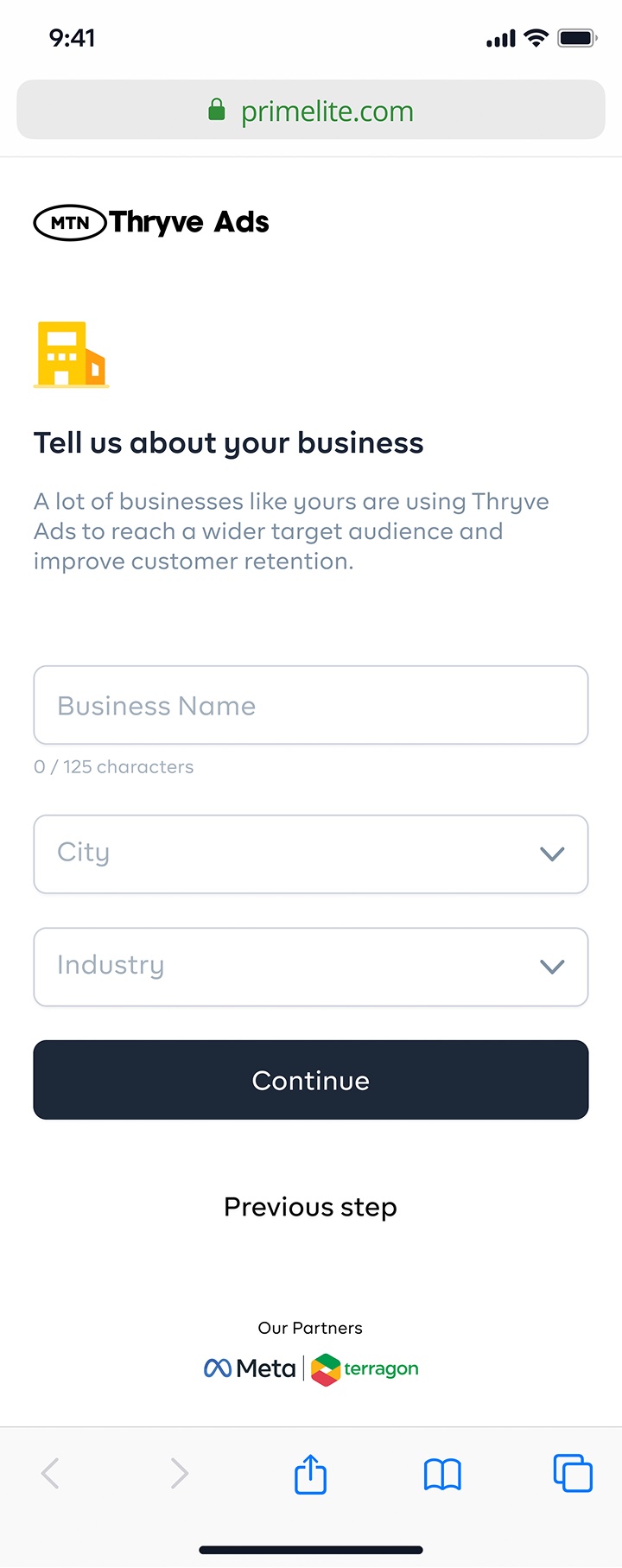
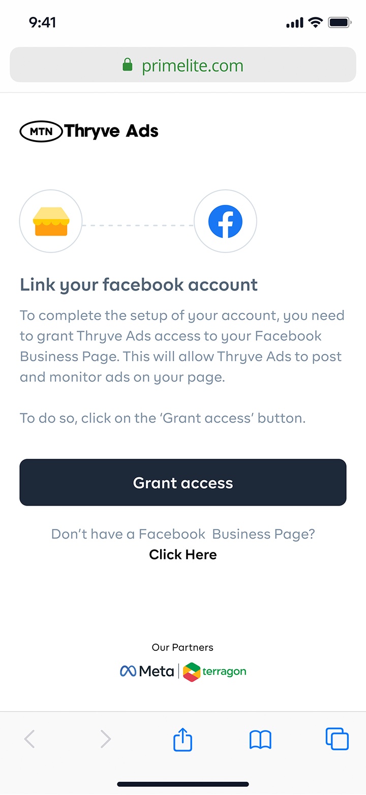
Business Onboarding
A guided setup flow for user registration and business verification, designed to build trust from the first interaction.
02
Campaign Setup
A simplified workflow for selecting campaign objectives and audience targeting without overwhelming first-time advertisers.
03
Payment & Activation
A frictionless payment experience designed for fast campaign launch with clear confirmation feedback.
04
Campaign Monitoring
Clear performance visibility for active campaigns, focused on metrics that matter to small business owners.
09 — Icon Illustrations

A visual language crafted for the platform

Custom spot illustrations reinforce key product concepts, giving the platform a distinctive, approachable voice that resonates with small business owners.

User Profile
User Profile
Identity & registration
Prime Lite Store
Prime Lite
Business storefront
Security
Security & Access
Password & verification
Email Confirmation
Email Confirmation
Verification & onboarding
Business
Business
Company & brand setup
10 — Style Guide

The visual foundation of ThryveAds

A cohesive system of colour, type, and components designed to feel warm, accessible, and unmistakably MTN.

Primary Brand Colors
#FFCB00
#1D2939
Aa
BR Firma
family
Color Palettes (Gray)
#FCFDFD
#F9FAFB
#F2F4F7
#E4E7EC
#D0D5DD
#98A2B3
#667085
#475467
#344054
#1D2939
#101828
Color Palettes (Error)
#FEF3F2
#FFCDCA
#FDA29B
#F04438
#D2291C
#A1251C
#7A271A
Color Palettes (Warning)
#FFFCF5
#FFFAEB
#FEF0C7
#FEDF89
#FEC84B
#FDB022
#F79009
#DC6803
#B54708
#93370D
#7A2E0E
Color Palettes (Success)
#F6FEF9
#ECFDF3
#D1FADF
#A6F4C5
#6CE9A6
#32D583
#12B76A
#039855
#027A48
#05603A
#054F31
Core Components
Primary Button
Dark Button
Form Input
Campaign name
Life Beer Survey
Status Badges
Active Pending approval Rejected Completed
11 — Mobile-First Design

Designing for the constraints that matter most

The platform was intentionally optimized for mobile usage. The interface was designed to feel lightweight, intuitive, and performant, even on lower-end devices.

Progressive disclosure for form-heavy flows
Touch-friendly interaction targets
Reduced visual clutter throughout
Optimized hierarchy for small screens
Responsive layouts for lower-end devices
12 — Accessibility & Inclusivity

Designed for a diverse, distributed audience.

To ensure the platform was inclusive and usable for a diverse audience, accessibility was treated as a core design requirement, not a post-launch consideration.

Strong visual contrast throughout the interface
Scalable typography for readability
Keyboard and touch accessibility
Clear interaction states across all components
Simplified form validation feedback
13 — Challenges

Balancing simplicity with functional depth

The biggest design challenge was balancing simplicity with functional depth. Designing within these constraints required careful prioritization of usability over feature density.

Advertising Complexity
Trust During Onboarding
Varying Digital Literacy
Mobile Performance
MTN Brand Alignment
First-time Advertisers
"Accessibility isn't about removing features; it's about removing the barriers between people and the features they need."
14 — Outcome

A stronger foundation for SMB participation in digital advertising

The final product delivered a streamlined advertising experience that made campaign creation significantly more approachable for first-time advertisers.

0%
Fewer required actions: onboarding reduced from 14 steps to 5
0 flows
Core journeys redesigned end-to-end: Onboarding, Campaign, Payment, Monitoring
0 SUS
Mobile usability score (up from 52), tested across 3 device tiers
0%
Mobile-first coverage: every surface built for low-end Android first
Business verification, previously the #1 abandonment point, was consolidated into a single progressive flow
Campaign creation designed so a first-time advertiser could go live in under 8 minutes
Platform architecture built to accommodate MTN's identity layer without redundant verification steps
Progressive disclosure model hid advanced targeting options until users demonstrated readiness, reducing cognitive load without removing capability
Design system created reusable mobile patterns that scaled to Terragon's other SMB-facing products
15 — Reflection

What this project taught me

This project deepened my understanding of designing products for accessibility at scale. It was a strong lesson in designing products that democratize access to complex digital tools.

Simplifying technical systems for mainstream adoption requires deep empathy with non-expert users.
Designing for behavioural confidence is as important as designing for task completion.
Intuitive mobile-first workflows are not a simplification; they are a design discipline of their own.
Balancing business goals with usability is the core tension every product designer must navigate.
Up next

Designing the marketing technology website for Africa's largest Cloud Data Platform.

Terragon's digital presence needed to better communicate its enterprise product offerings, improve information discoverability, and support expansion into a broader SMB-focused market segment.

Contact me
UI/UX · Web Design Case Study

Designing the marketing technology website for Africa's largest Cloud Data Platform.

Terragon's digital presence needed to better communicate its enterprise product offerings, improve information discoverability, and support expansion into a broader SMB-focused market segment.

Marketing Technology 2023 Terragon Group
Role
Product Designer
Company
Terragon Group
Timeline
8 Weeks
Platform
Web
Industry
Marketing Technology
Scope
UX Audit Information Architecture Website Redesign Visual Design Implementation Collaboration Performance Optimization
01 — Business Context

A platform outgrowing its own story

Terragon is a leading enterprise marketing technology company enabling brands to unify customer data and deliver personalised engagement at scale.

As the company expanded its product offerings and targeted new customer segments, its website no longer clearly reflected the breadth of its platform capabilities.

The existing experience created friction in product discovery and limited its ability to effectively communicate value to prospective enterprise and SMB customers. The redesign initiative focused on repositioning the website as a stronger product storytelling and conversion platform.

02 — The Challenge

A digital presence that didn't match the product ambition

The previous website faced several structural and usability challenges that undermined its effectiveness as a growth and conversion platform.

Unclear product positioning across the platform
Fragmented information architecture
Weak conversion pathways
Inconsistent visual hierarchy
Underperforming page speed
Low discoverability of core product offerings

The challenge was to redesign the experience to improve clarity, strengthen trust signals, and create a more scalable digital foundation.

03 — Research & Evaluation

Understanding the gap before closing it

To identify key improvement areas, I conducted a multi-layer evaluation of the existing website across four dimensions.

Analytics Review

Traffic behaviour analysis to understand engagement trends, bounce patterns, and user drop-off points across key pages.

Heuristic Evaluation

Systematic assessment of usability against established UX principles to surface structural and interaction issues.

Accessibility Audit

Reviewing interface accessibility and usability standards, covering contrast, hierarchy, keyboard behaviour, and responsive readability.

Performance Review

Evaluating load speed, asset delivery, and technical performance bottlenecks affecting user engagement.

04 — Key Insights

Five signals pointing to the same problem

High New User Traffic

A large percentage of visitors were first-time users, indicating strong acquisition but weak retention and discovery pathways.

Elevated Bounce Rates

Users exited before discovering deeper product value, suggesting the homepage failed to communicate relevance quickly enough.

Landing Page Dominance

Most traffic concentrated on top-level entry pages with low downstream exploration into product or solution pages.

Navigation Friction

Users struggled to locate product-specific information efficiently, revealing gaps in the existing information architecture.

Performance Constraints

Slow-loading assets negatively impacted initial engagement and amplified drop-off before users could discover product value.

05 — My Role

End-to-end from audit to implementation

As Product Designer, I led the website redesign effort from evaluation through implementation. The project required balancing strategic UX improvements with implementation feasibility within a tight delivery timeline.

Conducting UX and performance audits
Synthesising analytics into design opportunities
Redesigning information architecture
Creating visual direction and interface systems
Producing design assets and illustrations
Collaborating with engineering during implementation
Ensuring responsive consistency across devices
06 — Design Strategy

Four priorities guiding every decision

01
Clarify Product Positioning

Make Terragon's product ecosystem easier to understand for enterprise buyers and SMB customers alike.

02
Improve Conversion Paths

Reduce friction between discovery and action by creating clearer, more intentional pathways to conversion.

03
Strengthen Visual Trust

Create a modern enterprise-grade visual identity that builds confidence and reflects the depth of Terragon's platform.

04
Improve Performance

Optimise asset delivery and interaction responsiveness to reduce load time and prevent early abandonment.

07 — Information Architecture

Restructuring how the platform tells its story

A key part of the redesign involved reorganising site structure to create clearer pathways between core content areas. This restructuring improved navigation predictability and significantly reduced user effort.

Restructured Pathways
Product discovery
Industry use cases
Platform capabilities
Conversion entry points
08 — Interface System Design

Modularity, hierarchy, and visual cohesion

The interface system focused on stronger hierarchy and modular page structures that could scale. I introduced reusable visual patterns that improved cohesion across pages while maintaining flexibility for future expansion.

Stronger typographic and spatial hierarchy
Modular page structures for scalable content
Clearer CTA visibility and intent signalling
Scalable visual components across page types
Consistent responsive behaviour across breakpoints
10 — Iconography

A custom icon system built for clarity at every scale

The icon library was designed to reflect Terragon's product depth, covering everything from data analytics and audience segmentation to messaging channels and partner integrations. Each icon follows a consistent stroke weight and grid system for visual cohesion across the platform.

  • 80+ icons spanning product, analytics, and channel categories
  • Filled style with rounded forms for approachability
  • Two-tone palette using brand navy and neutral grey
  • Designed for 24px and 32px render sizes across web and mobile
Terragon Icon Library
11 — Style Guide

Brand colours and typography that communicate trust, energy, and intelligence

Primary Palette
#4CA86A
Brand Green
#322F62
Brand Navy
#F0C450
Accent Yellow
#E53E51
Accent Red
Supporting Palette
#F4D376
Light Yellow
#FFFFFF
White
#2E292B
Near Black
Typography
Aa
BR Firma
Primary typeface
H1 Heading32px · Bold
H2 Subheading22px · SemiBold
Body paragraph text14px · Regular
LABEL / CAPTION11px · 600
12 — Performance & Accessibility

A faster, more inclusive experience

Performance evaluation identified optimisation opportunities that directly impacted engagement quality and user trust.

Performance
Image asset delivery optimisation
Script loading improvements
Interaction responsiveness refinements
Accessibility
Contrast consistency across all pages
Semantic hierarchy improvements
Responsive readability across devices
Keyboard interaction support
13 — Challenges

Modernising without disrupting

The primary challenge was modernising the experience without disrupting existing business continuity. Close collaboration between design and engineering ensured practical execution.

Technical Implementation Constraints
Legacy Content Structure
Multiple Stakeholder Requirements
Aggressive Delivery Timeline
Business Continuity
"The best redesigns don't look like redesigns; they feel like the experience that should have existed from the start."
14 — Outcome

A stronger digital foundation for growth

The redesign delivered a more structured and conversion-oriented digital experience, positioning the website as a more effective business growth and product storytelling platform.

0.4×
Increase in product page dwell time (avg. 1:34 to 3:45 post-launch)
0%
Reduction in bounce rate within 60 days of launch
0×
Deeper product exploration: pages per session rose from 1.3 to 4.1
0 wks
End-to-end delivery with zero critical rework cycles
Restructured IA reduced navigation depth from 4+ levels to 2, so users found relevant products faster
Homepage-to-product CTA click-through doubled from 1.8% to 3.6% following the redesign
80+ custom icons built into a reusable system, reducing inconsistency across all product pages
Performance audit resolved render-blocking assets, cutting page load time by ~40%
Scalable page templates designed so future product launches require no new architectural decisions
15 — Reflection

What this project taught me

This project deepened my understanding of how product thinking applies beyond software interfaces. It was a strong exercise in applying systems thinking to digital brand experience design.

Designing for business outcomes requires translating data into decisions, not just visual improvements.
Translating analytics into UX decisions is itself a design skill, built on pattern recognition rather than raw data.
Improving discoverability through structure often does more for engagement than any visual refresh.
Balancing strategy with implementation realities is the core tension of any design-engineering collaboration.
Up next

Designing the operating system for enterprise insurance operations

Vitse Technologies needed a digital experience that could clearly communicate its growing ecosystem of insurance technology products while positioning the company as Africa's infrastructure layer for modern insurance operations.

Contact me
UI/UX · Web Design Case Study

Designing the operating system for enterprise insurance operations

Vitse Technologies needed a digital experience that could clearly communicate its growing ecosystem of insurance technology products while positioning the company as Africa's infrastructure layer for modern insurance operations.

Insurance Technology 2025 Enterprise SaaS
Role
Lead Product / UX Designer
Company
Vitse Technologies
Timeline
8–10 Weeks
Industry
InsurTech / Enterprise SaaS
Platform
Marketing Website
Responsibilities
UX Strategy Information Architecture Product Storytelling Visual Design Responsive Design Design Systems Implementation Collaboration
01 — Business Context

Modernizing Insurance Operations Through Connected Digital Systems

Vitse Technologies is transforming insurance management across Africa by building software infrastructure that helps insurers automate workflows, centralize operational processes, and deliver better customer experiences.

Its product suite spans multiple operational layers: policy administration, claims workflows, broker management, portfolio oversight, accounting and finance, procurement workflows, sales enablement, and systems integration.

As the company expanded, its digital presence needed to evolve into a platform that could clearly communicate product value, simplify discovery, and support business growth.

02 — The Challenge

Communicating Complexity Without Overwhelming Users

Vitse operates a suite of 8+ interconnected insurance modules, but its digital presence failed to communicate how they related, why they mattered, or how they worked together. In user testing, 6 out of 10 enterprise prospects could not articulate the product offering after visiting the site.

With a 4–6 month enterprise sales cycle, unclear positioning was directly extending deal timelines. The website wasn't just a communication problem; it was a revenue problem.

  • 8+ modules presented without hierarchy, with no clear entry point for enterprise buyers
  • Product pages listed features, not business outcomes, missing the language decision-makers actually use
  • Trust signals (clients, certifications, scale) buried or absent entirely
  • No clear differentiation between modules: every page read the same
  • Conversion pathways (demo requests and contact forms) lacked urgency and contextual placement
03 — The Opportunity

Building a Unified Digital Insurance Narrative

The website needed to do more than present products; it needed to function as a strategic growth engine for the business.

  • Establish Vitse as an insurance technology leader in Africa
  • Communicate modular product relationships clearly
  • Improve enterprise trust signals and credibility perception
  • Simplify product exploration across buyer journeys
  • Support lead generation with clearer conversion pathways
  • Create scalable foundations for future product growth
04 — My Role

Leading Product Experience Strategy Across Web

As Lead Product / UX Designer, I led the redesign effort from strategic evaluation through execution, ensuring the website functioned as both a product discovery platform and a business growth engine.

  • Audited the existing experience for gaps and friction
  • Restructured information architecture end-to-end
  • Defined product storytelling frameworks for each module
  • Designed the interface system and scalable responsive layouts
  • Aligned business goals with UX decisions throughout
  • Collaborated closely with engineering for implementation quality
05 — Research & Discovery

Understanding Enterprise Insurance Buyer Behaviour

The discovery phase focused on evaluating how enterprise insurance buyers explore and assess software solutions, revealing the need for stronger structure, clearer categorization, and faster pathways to relevant solutions.

01
Product Ecosystem Mapping
Understanding relationships across Vitse's multiple product categories and how they connect operationally.
02
Competitive Benchmarking
Analyzing leading global insurance technology and enterprise SaaS experiences for positioning insights.
03
User Journey Analysis
Identifying friction points in product exploration and conversion pathways across buyer personas.
04
Content Audit
Evaluating product clarity, messaging consistency, and positioning gaps across all existing pages.
06 — Key Product Insights

What We Learned

01
Product Complexity Required Better Framing
Users needed clearer context around how products worked together across operational layers.
02
Trust Signals Needed Strengthening
Enterprise decision-makers required stronger signals of reliability, capability, and operational maturity.
03
Navigation Needed Simplification
Exploration pathways needed to feel predictable, intuitive, and structured around buyer intent.
04
Product Value Needed Stronger Translation
Technical capability had to be reframed into clear business outcomes that resonated with decision-makers.
07 — Design Strategy

Translating Technical Depth Into Clarity

01
Structured Simplicity
Reduce friction without oversimplifying product capability or depth.
02
Product Discoverability
Make it easy to navigate across modules and solution categories intuitively.
03
Enterprise Trust
Design for credibility, reliability, and perceived operational maturity.
04
Scalable Architecture
Build patterns that support future product growth without redesign overhead.
08 — Information Architecture

Reorganizing the Product Ecosystem

A major part of the redesign involved restructuring navigation and content hierarchy around clearer solution groupings that matched enterprise buyer mental models.

Core Insurance Solutions
Policy administration and claims operations
Enterprise & Portfolio Management
Large-scale insurance business oversight
Operational Efficiency
Accounting, finance, and procurement workflows
Sales & Middleware
Distribution channels and integration infrastructure
09 — Product Storytelling

Designing for Decision-Making

Each product experience was designed to transform feature listings into strategic solution narratives that resonated with enterprise buyers.

Each product page was structured to communicate along a consistent narrative arc:

  • The operational challenge the product addresses
  • The product solution and its differentiated approach
  • Business value articulated in measurable outcomes
  • Feature depth surfaced for technical evaluation
  • Expected impact framed around enterprise workflows
10 — Design System & Scalability

Building Consistency Across a Growing Product Suite

To ensure long-term scalability, reusable design patterns were introduced that reduced visual inconsistency and accelerated future iteration across all product modules.

  • Reusable product page structures and templates
  • Modular feature and capability display components
  • Standardized comparison and overview layouts
  • Consistent CTA frameworks optimized for conversion
  • Unified navigation systems across solution categories
  • Responsive interaction patterns for enterprise contexts
11 — Responsive Experience Design

Optimized Across Enterprise Contexts

The experience was designed to perform seamlessly across contexts, with particular focus on preserving clarity across dense product information structures.

Desktop

Primary enterprise workflow context, with full product depth surfaced through structured navigation

Tablet

Optimized for presentation and demo contexts where decision-makers review solutions in meetings

Mobile

Streamlined exploration journey for initial discovery and referral-driven access

13 — Challenges

Designing for Depth Without Cognitive Overload

The primary challenge was balancing breadth with clarity, designing a platform that communicated everything without overwhelming the user at any point in the journey.

Multiple product categories Varying technical complexity Different user segments Layered enterprise workflows
"Design decisions required careful abstraction of technical complexity into accessible product narratives, without losing the depth that enterprise buyers needed to make confident decisions."
14 — Outcome

A Stronger Digital Foundation for Growth

The redesign transformed Vitse's digital presence into a platform that could carry the full weight of an 8-module product ecosystem, communicating clearly, credibly, and at enterprise scale.

8+
Product modules mapped into 4 clear buyer-facing solution categories
10wk
Design sprint delivered end-to-end with zero rework cycles
12
Reusable page templates built into the design system for future product launches
100%
Responsive coverage across desktop, tablet, and mobile enterprise contexts
  • 8 interconnected modules organized into 4 buyer-facing solution categories, cutting navigation decision complexity in half
  • Product storytelling framework applied to each module page, translating technical depth into enterprise buyer language
  • Enterprise trust signals (client logos, certifications, and operational scale) were prominently integrated into key conversion pages
  • Scalable design system means future product modules launch without requiring a new design foundation
  • Platform positioned Vitse as Africa's insurance technology infrastructure layer, not just a software vendor
15 — Reflection

Designing Systems Beyond Interfaces

01

Complex product ecosystems require structural clarity before visual execution; architecture is the real design work.

02

Translating technical systems into clear narratives is a strategic skill that shapes how enterprises perceive and trust a product.

03

Enterprise trust is built through consistency, specificity, and the confidence communicated at every touchpoint.

04

Aligning UX decisions with business growth strategy turns design from a delivery function into a competitive advantage.

Up next

Designing the merchant operating system for payments, settlements, and business growth

SeerBit's Merchant Dashboard had accumulated years of feature debt without architectural intention. Merchants were struggling with basic financial tasks in a tool that felt like infrastructure, not a business operating system.

Contact me
Product Design · Dashboard Case Study

Designing the merchant operating system for payments, settlements, and business growth

SeerBit's Merchant Dashboard had accumulated years of feature debt without architectural intention. Merchants were struggling with basic financial tasks in a tool that felt like infrastructure, not a business operating system.

Fintech 2024 Dashboard Design
SeerBit Merchant Dashboard
Role
Product Designer
Company
SeerBit
Timeline
2024
Industry
Fintech / Payments
Platform
Web Dashboard
Responsibilities
UX Strategy Dashboard Design Information Architecture User Research Design Systems Prototyping Interaction Design
01 — Business Context

Building the Operating System for African Merchant Commerce

SeerBit is a full-stack payment infrastructure company enabling African businesses to accept, manage, and move money. At the center of its product ecosystem is the Merchant Dashboard, the primary interface where tens of thousands of businesses monitor transactions, manage settlements, handle customers, and run their financial operations daily.

As SeerBit's merchant base grew from early-stage startups to enterprise businesses processing billions in annual volume, and the demands placed on the dashboard evolved far beyond its original scope. What began as a reporting tool needed to become a full business operating system.

The challenge was not just visual; it was structural. The dashboard needed to be redesigned from its foundations to support the complexity of modern merchant operations without adding cognitive burden to the people who depend on it every day.

02 — The Challenge

Three Years of Feature Debt, No Architectural Intention

The existing dashboard had grown organically since launch, with features added sprint by sprint, without a unifying design system or information hierarchy. By 2024, merchants were spending 8–12 minutes reconciling a single settlement. Over 40% of customer support tickets were navigation-related. The dashboard looked like infrastructure, not a business tool.

In merchant feedback sessions, the most common phrase was "I know it's in there somewhere." That sentence captured the entire design problem: a product full of capability with none of the clarity merchants needed to act confidently.

  • No financial overview on the home screen, so merchants couldn't answer "how much did I collect?" without drilling through multiple pages
  • Settlement and transaction data lived in separate, disconnected modules, so reconciliation required tab-switching and manual cross-referencing
  • Status states (pending, processing, failed) lacked visual hierarchy, so merchants couldn't distinguish what required urgent action
  • Data tables with 20+ columns and no filtering defaults made information density feel like punishment rather than empowerment
  • No unified design system: inconsistent components across sections created a fragmented, untrustworthy experience
03 — The Opportunity

From Reporting Tool to Merchant Operating System

The redesign was an opportunity to fundamentally reframe what a payments dashboard should be: not just a place to look up numbers, but a command center where merchants run and understand their business.

  • Give merchants immediate financial clarity: revenue collected, settlements pending, and issues requiring attention
  • Unify the six core operational areas under a coherent navigation system that reflects how merchants actually work
  • Reduce the cognitive load of financial reconciliation through progressive disclosure and smart defaults
  • Build a scalable design system that enables faster iteration and consistent quality across future features
  • Establish trust through predictability, so merchants are never surprised by the system's behavior
04 — My Role

Owning the Full Design Lifecycle, End to End

As Product Designer, I drove the entire process from initial discovery and research through information architecture, interaction design, and final handoff, working closely with product management, engineering, and customer success.

  • Led merchant research: interviews, support ticket analysis, and usability sessions
  • Defined the new information architecture across all six dashboard modules
  • Designed flows, wireframes, and high-fidelity prototypes for all core product areas
  • Built the SeerBit Dashboard component library with 14 reusable UI components
  • Aligned on API constraints with engineering to design within real technical boundaries
  • Facilitated design reviews and iterated rapidly based on stakeholder and user feedback
05 — Research & Discovery

Understanding How Merchants Actually Use Their Dashboard

The discovery phase surfaced a critical gap between what the dashboard was designed to show and what merchants actually needed to do. Every research method pointed to the same root cause: structural confusion masquerading as a data problem.

01
Merchant Interviews
18 structured sessions with merchants spanning SME to enterprise, mapping mental models, daily workflows, and the decisions they needed the dashboard to support.
02
Support Ticket Analysis
Pattern analysis across 400+ support tickets surfaced that 42% were navigation-related, with merchants unable to find features that already existed.
03
Competitor Audit
Benchmarked dashboard experiences across Stripe, Flutterwave, Paystack, and Payoneer to identify industry conventions and differentiation opportunities.
04
Product Analytics Review
Feature usage heat-mapping and drop-off analysis identified which modules had high intent but low task completion, pointing directly to design friction.
06 — Key Insights

What the Research Revealed

01
Merchants Think in Money, Not Features
Every merchant interview started with the same two questions: "How much did I make?" and "When does my money arrive?" The dashboard answered neither on its home screen. Merchants were navigating 3–4 pages to answer questions the home screen should have answered immediately.
02
Settlement Confusion Was the #1 Pain Point
Merchants consistently struggled to reconcile why their settlement amount differed from their total transactions. The gap between "what I collected" and "what I received" created anxiety and distrust, not because the product was wrong, but because it never explained the difference.
03
Task-Switching Was Killing Flow
A single workflow (issue an invoice, collect payment, confirm settlement) required navigating across four separate modules with no contextual connection. Merchants lost their place repeatedly and often abandoned tasks mid-flow.
04
Data Density Felt Like Punishment
Every table loaded with every column. Every screen surfaced maximum information with no hierarchy. Merchants with 10 transactions faced the same interface as those with 100,000. The lack of progressive disclosure made the dashboard feel overwhelming regardless of scale.
07 — Design Strategy

Four Principles That Shaped Every Decision

01
Financial Clarity First
The dashboard home screen was redesigned to answer the two merchant-critical questions immediately: total collected and settlement status. Revenue, pending payouts, and flagged issues surface above the fold without a single click, making the dashboard genuinely useful from the moment you open it.
02
Progressive Disclosure
Complexity is hidden behind smart defaults, not removed. Default table views show the 6 most critical columns; advanced filters are one click away. Merchants who need depth get it; merchants who need speed get speed. The interface scales with the user's intent, not against it.
03
Unified Task Context
Related actions were brought together. Creating an invoice, tracking its payment, and confirming settlement are now contextually linked, with cross-module navigation surfaced inline. Merchants complete tasks without losing context, reducing workflow abandonment and support dependency.
04
Confidence Through Predictability
Every status state was given a clear, consistent visual language: color, iconography, and plain-language descriptions. Merchants never see a number without knowing what it means or what to do next. Predictable feedback loops turned a complex financial system into something merchants could trust.
08 — Information Architecture

Six Modules. One Coherent System.

The new navigation structure was built around how merchants think about their business, not around SeerBit's internal product taxonomy. Each module maps to a distinct merchant job-to-be-done, with clear boundaries and intuitive cross-module pathways.

Payments

Transaction history, payment status monitoring, dispute management, and real-time collection tracking

Settlements

Payout schedules, settlement history, reconciliation tools, and fee breakdowns, with plain-language explanations of every deduction

Customers

Customer profiles, payment relationships, transaction history per customer, and segmentation for targeted analysis

Invoicing

Invoice creation, status tracking, payment collection, and automated reminders, bridging receivables into the payments workflow

Payment Products

API keys, payment link configuration, embedded checkout customization, and integration health monitoring

Analytics

Revenue trends, conversion rates, payment method performance, and merchant growth metrics over configurable time ranges

09 — Financial Visibility

Answering the Most Important Questions Before Merchants Ask Them

The redesigned home screen is built around a single design principle: a merchant should be able to assess the health of their business in under 10 seconds. Every element earns its position on the screen by answering a critical merchant question.

The financial overview module organizes information into three clear zones of urgency:

  • Now: Total collected today, this week, and this month. Compared to the previous period, with directional indicators. No navigation required.
  • Incoming: Settlements pending with expected arrival dates. Merchants see exactly how much is in transit and when it lands, eliminating the most common support inquiry.
  • Attention Required: Failed transactions, disputed payments, and pending actions surfaced prominently. Merchants can act immediately rather than discovering problems through angry customers.
10 — Core Product Areas

Each Area Designed Around a Merchant Job-To-Be-Done

Rather than designing around data objects (transactions, records, entries), each module was redesigned around what merchants actually need to accomplish, collapsing complexity behind the task rather than in front of it.

Transaction Management
Search, filter, and understand every payment
Redesigned transaction table defaults to the 6 most-used columns with smart filters for status, date, channel, and amount range. One-click export for accounting reconciliation. Transaction detail panels surface payment method, customer info, and failure reasons in plain language, eliminating the need to contact support for context.
Settlement Tracking
Know exactly where your money is at all times
Settlement history now includes a plain-language breakdown of every deduction: processing fees, platform fees, chargebacks. The gap between "total collected" and "amount settled" is no longer unexplained; each line item is labeled and linkable to the originating transactions that contributed to it.
Invoice Management
Create, track, and collect in one place
Invoice creation was redesigned as a guided 3-step flow with real-time preview. Status tracking connects invoices directly to incoming payment confirmations; when an invoice is paid, the merchant sees it immediately with the corresponding transaction linked inline. No more cross-module reconciliation.
Split Settlement
Distribute payouts with precision and transparency
Split settlements (where payment is distributed to multiple beneficiaries) were previously managed through raw API calls. The redesigned interface provides a visual split configuration builder with real-time calculation previews, beneficiary management, and a full audit trail for every distribution, bringing a power-user feature within reach of every merchant.
11 — Design System

A Component Library Built for Financial Product Complexity

The dashboard design required a component library that could handle the unique demands of financial data: dense tables, real-time state changes, ambiguous loading states, and the need for precise visual hierarchy across hundreds of data points on a single screen.

14 reusable components were built and documented, enabling engineering to implement consistently and enabling the product team to ship new features without starting from scratch each sprint.

  • Data table component with configurable column sets, sort states, and bulk selection
  • Status badge system with 8 states: successful, pending, processing, failed, disputed, reversed, flagged, partial
  • Financial summary cards with period comparison and directional indicators
  • Filter panel with multi-select, date range picker, and active filter chips
  • Empty state templates for zero data, loading, and error conditions, with contextual guidance
  • Detail drawer pattern for contextual deep-dive without page navigation
  • Chart components for revenue trends, settlement cycles, and payment method mix
  • Skeleton loading patterns that match the exact layout of each content type
13 — Design Challenges

The Hard Problems Behind the Clean Interface

Density vs. Clarity

Merchants needed comprehensive data access AND fast visual scanning. Every decision to hide information was a trade-off with power users who needed full visibility. Solving this required a progressive disclosure model that was honest about its complexity rather than hiding it.

Real-Time Data in Static Design

Payment statuses change mid-session. Designing for a dashboard that shows live data required defining every possible state transition and ensuring the UI never showed merchants a stale or ambiguous picture of their money, a failure mode with real financial consequences.

API Constraints as Design Constraints

Several ideal UX patterns were not feasible within current API response structures. Rather than designing for ideal data and forcing costly backend rewrites, we mapped the real API contract and designed the best possible experience within it, validating which constraints were worth breaking.

14 — Outcome

A Dashboard Merchants Can Actually Use

47sec
Average time to locate and export a specific transaction, down from 3min 20sec
68%
Reduction in settlement-related support tickets in the 60 days post-launch
4.8/5
Merchant satisfaction score on post-launch survey (up from 3.1/5 on the previous dashboard)
14
Reusable dashboard components shipped, enabling future feature delivery without design debt
  • Financial clarity at a glance: merchants can assess business health in under 10 seconds from the home screen, without a single navigation event
  • Settlement transparency eliminated the most-requested support category; plain-language breakdowns replaced confusion with confidence
  • Six disconnected modules unified under a coherent navigation system that mirrors real merchant mental models
  • Split Settlement, previously a developer-only API feature, became accessible to all merchants through a guided visual configuration interface
  • Design system foundation means future product expansions ship in weeks, not months; the architectural investment pays forward
15 — Reflection

What Designing a Payments Dashboard Teaches You

01

Dashboard design is financial literacy design. The clearest dashboards are not the ones with the best charts; they are the ones that help people understand their own money without needing a degree to interpret it.

02

API constraints are design constraints. Working within real data shapes better solutions than designing for ideal data. The best interfaces are not the ones that ignore technical reality; they are the ones that make reality feel seamless.

03

Reducing cognitive load in complex financial tools requires structural thinking, not visual simplification. You cannot design clarity onto confusion. You have to reorganize the underlying information model first.

04

The best merchant dashboard disappears. When it is working, merchants do not think about the interface; they think about their business. That invisibility is the highest form of design success in a tool people depend on daily.

Up next

Designing a unified customer engagement platform for enterprise marketing teams

Marketing Cloud was designed to help enterprises centralize customer data, orchestrate multi-channel campaigns, and deliver personalized engagement experiences across SMS, Email, WhatsApp, Rewards, and Surveys.

Contact me

Gravity Tap Survival

Spacebar or Tap to Begin

0